DIZ studio
YEAR: 2022
CLIENT: 点烛照明设计
TYPE: BRAND IDENTITY
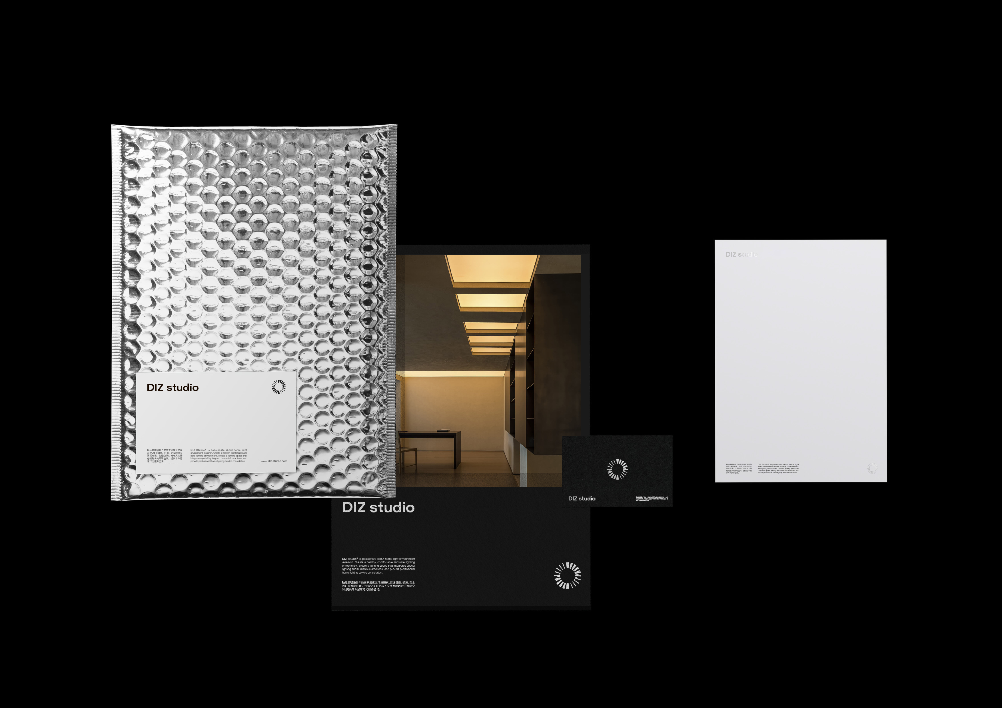
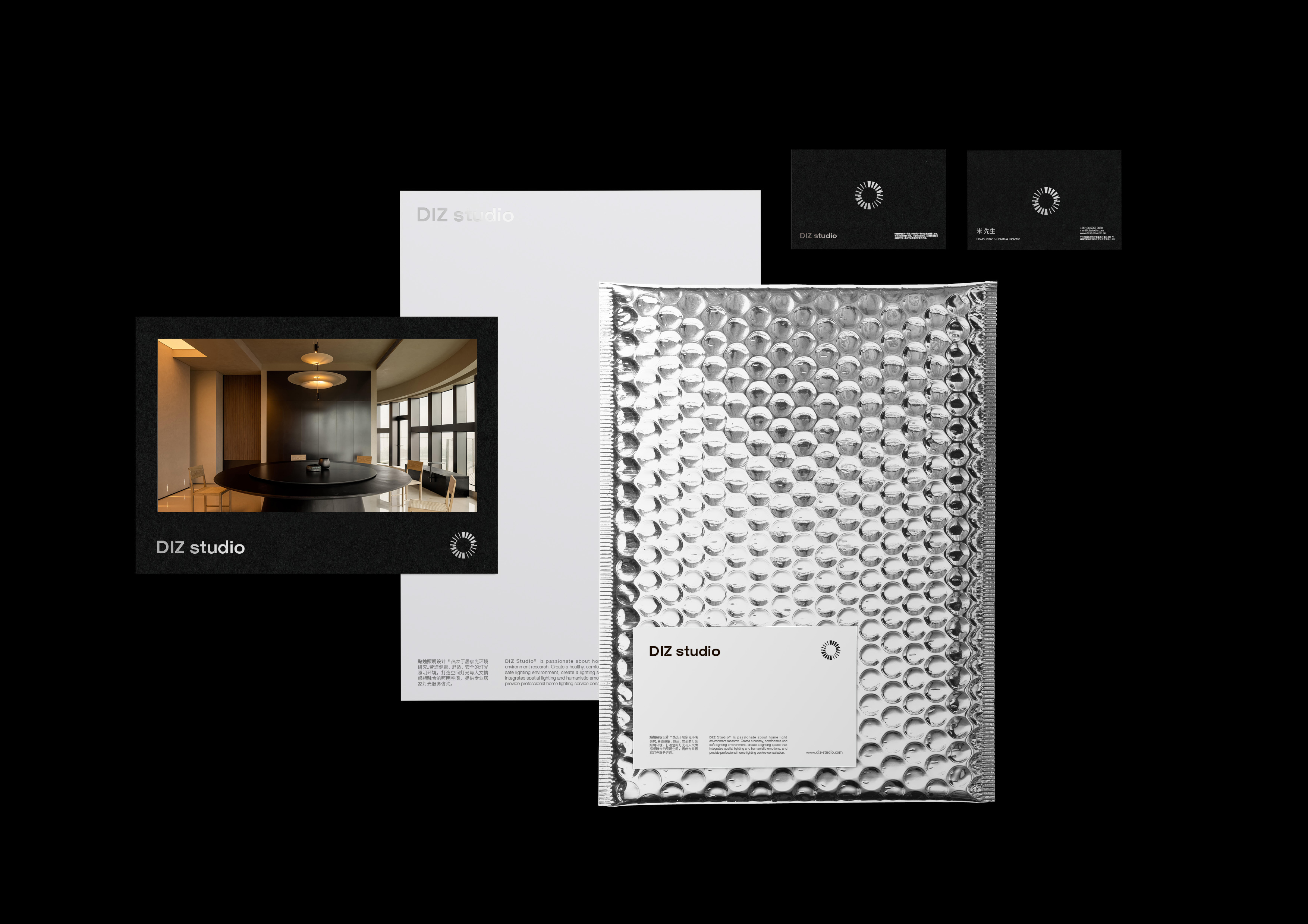
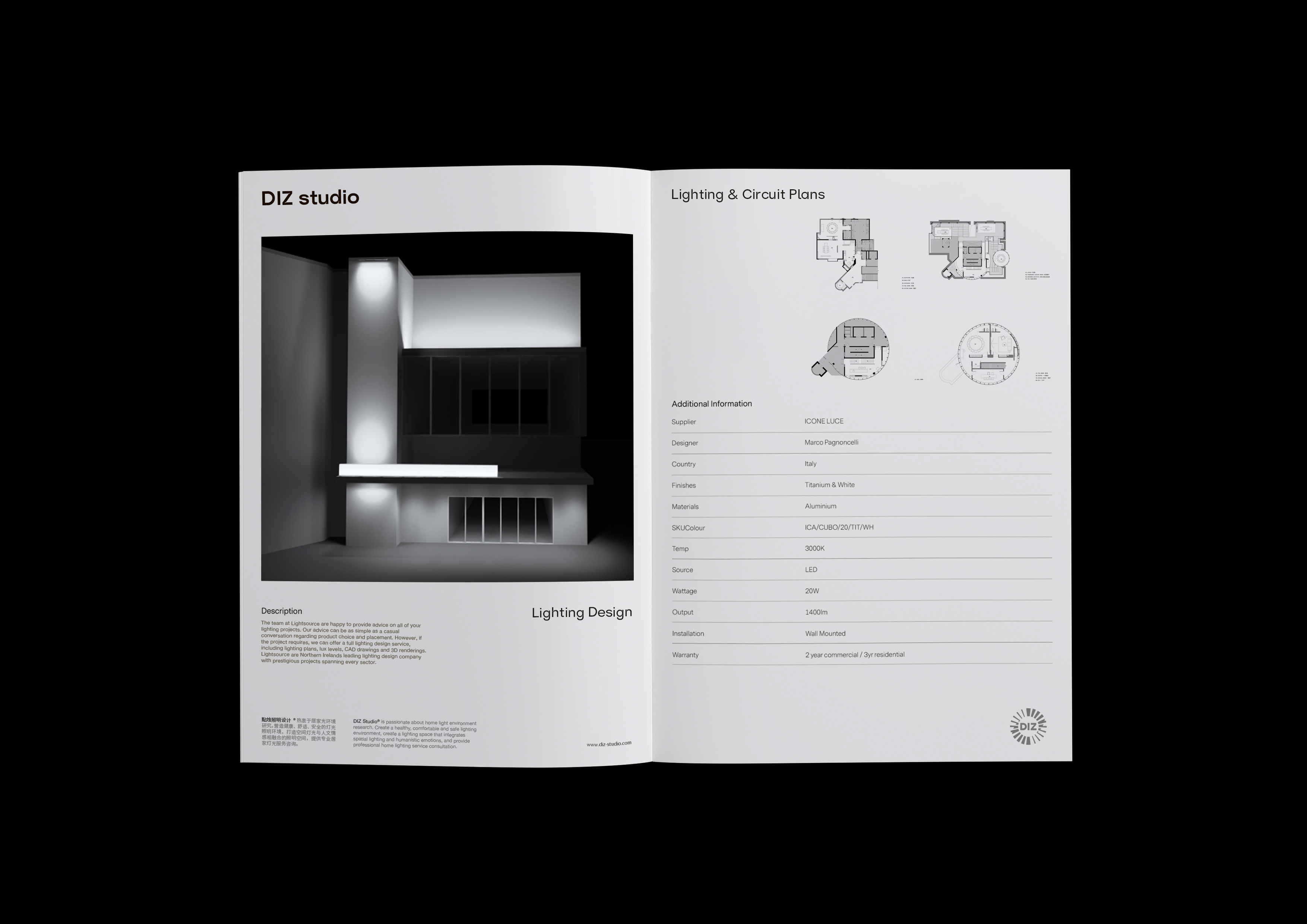
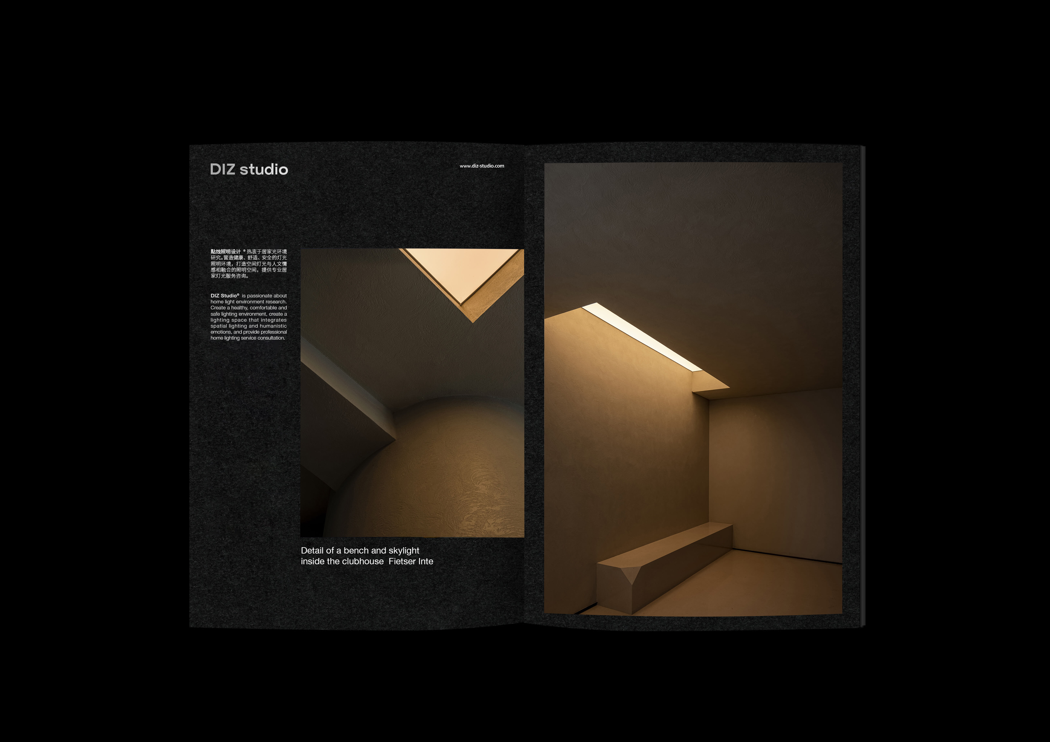
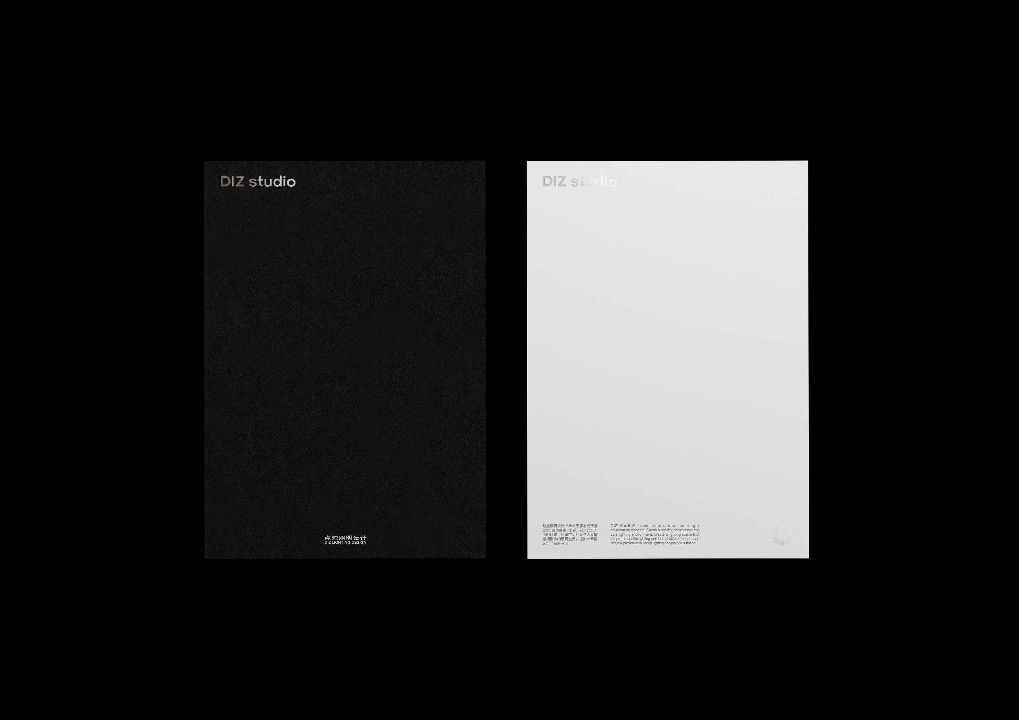
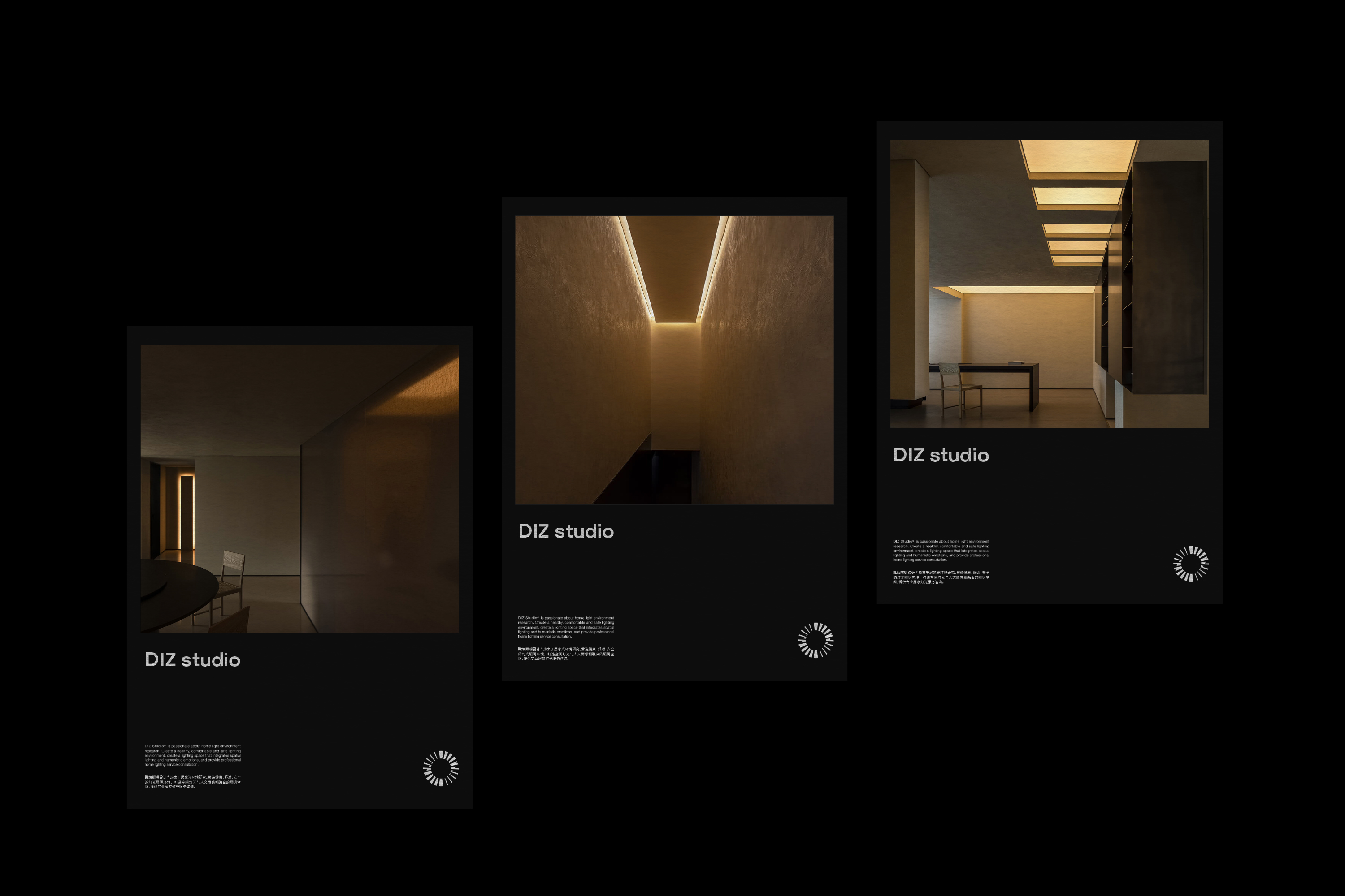
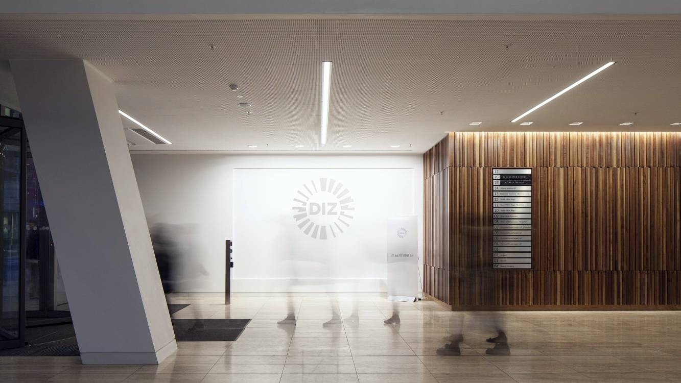
點烛照明设计® 热衷于居家光环境研究。营造健康、舒适、安全的灯光照明环境,打造空间灯光与人文情感相融合的照明空间,提供专业居家灯光服务咨询。
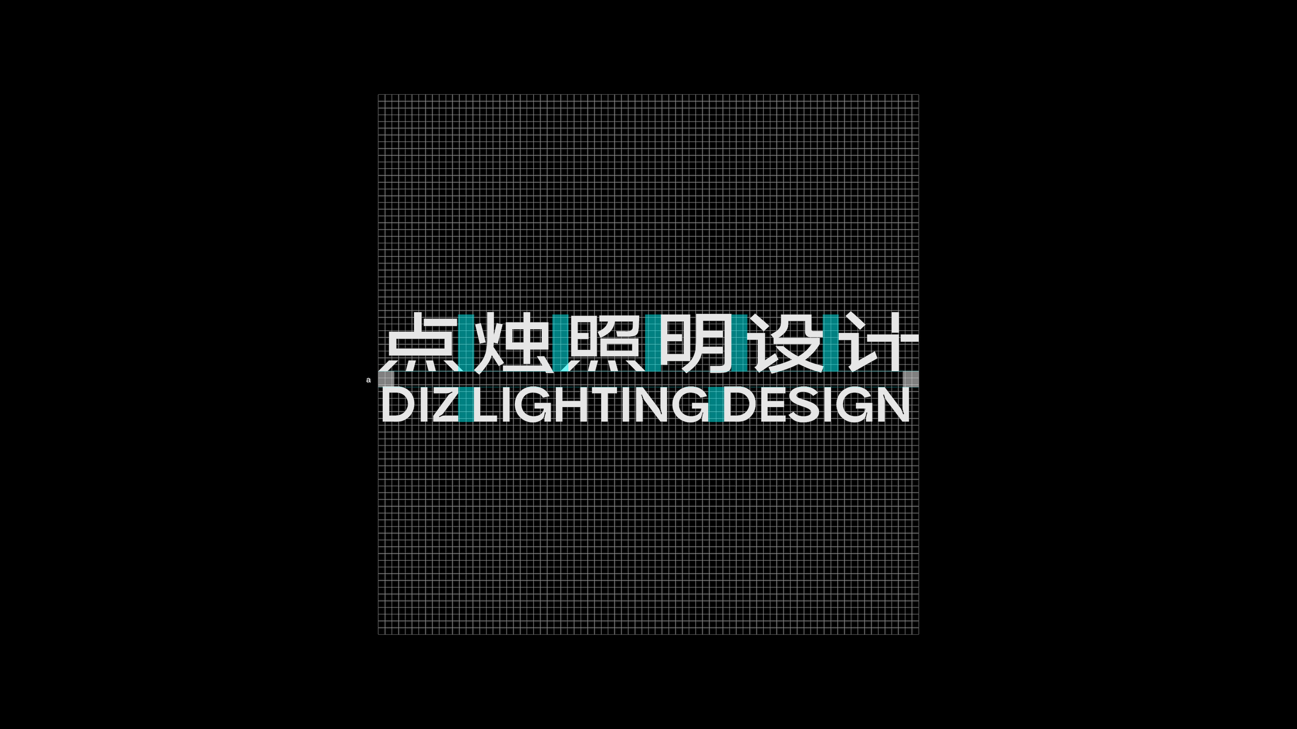
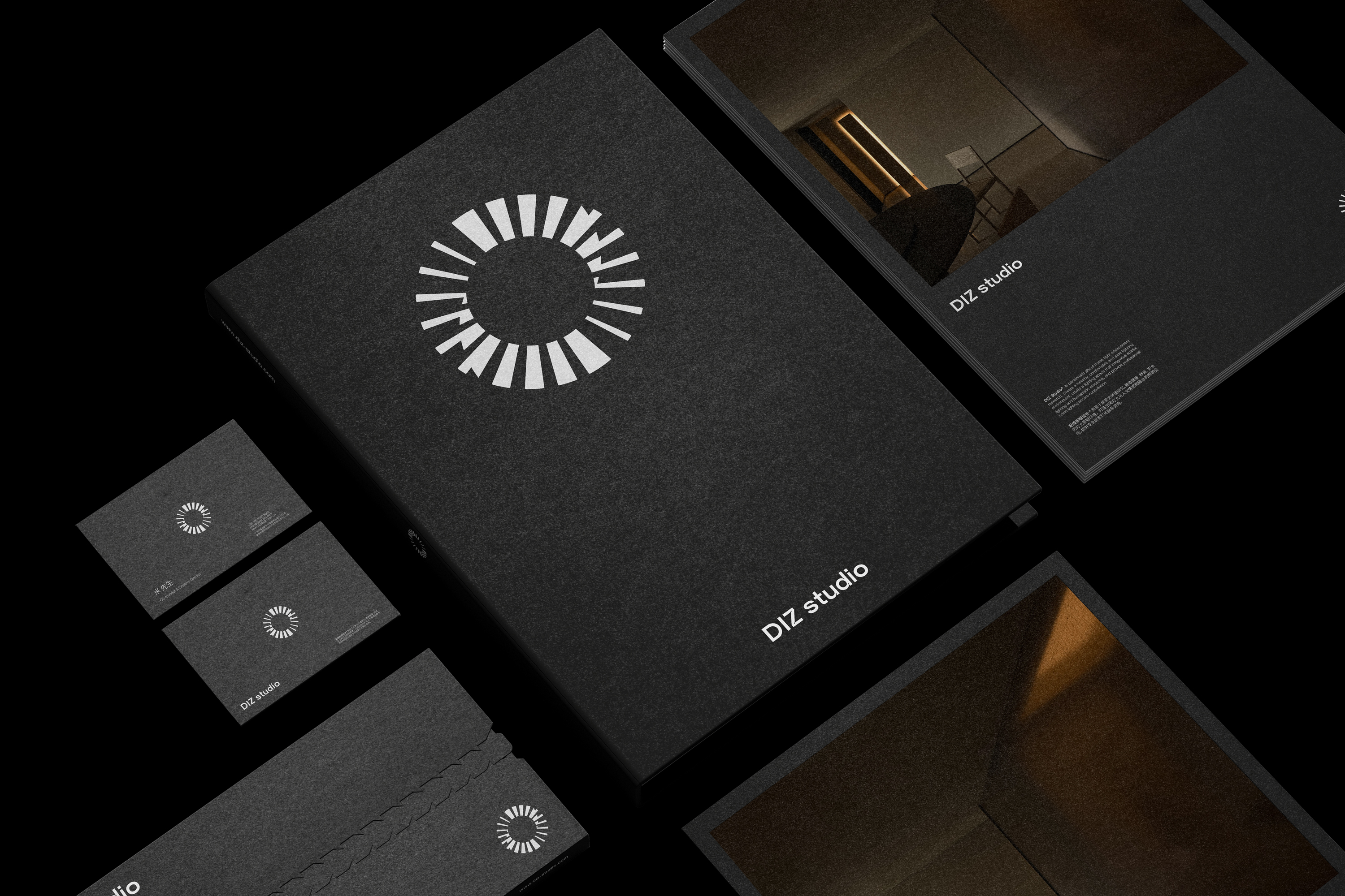
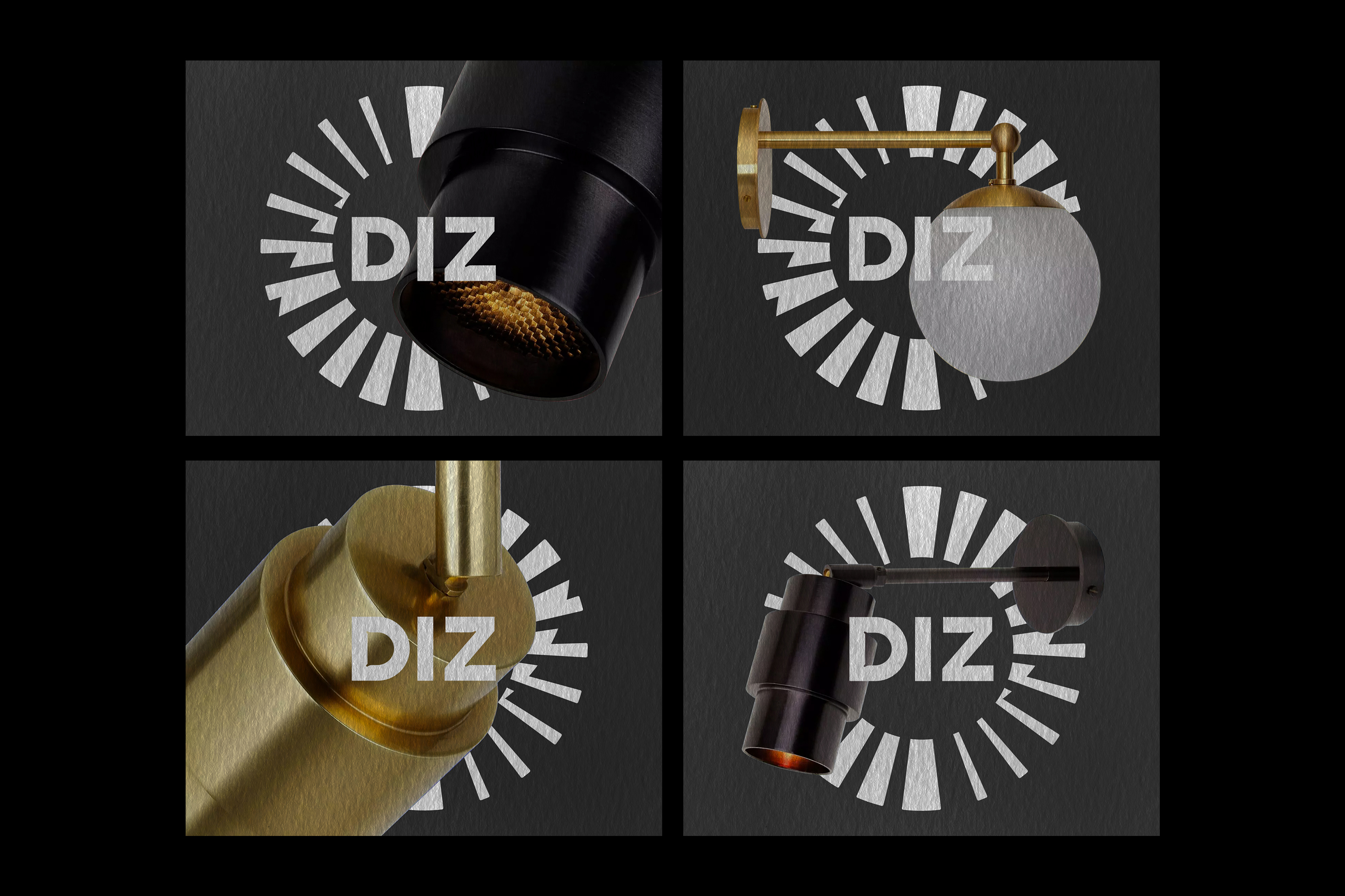
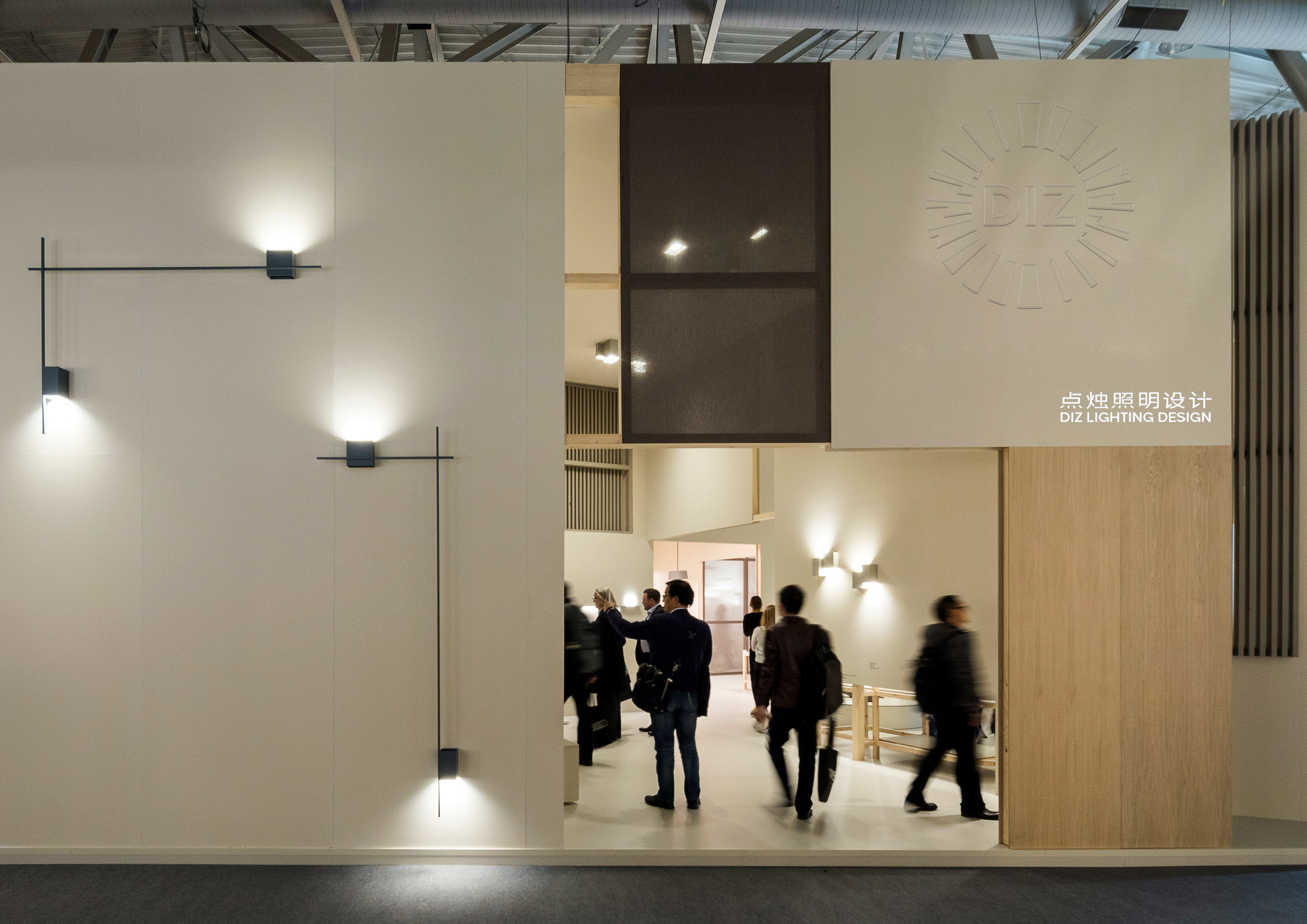
Logo标识设计以“光”为切入点,提取光(✴︎)的形态形成一个具备科技感、动态感的图形,将设计化、定制化、品质感传递给客户。中文标识部分,在特殊环境中可被独立使用,在与主体标识的组合使用中,其功能侧重于辅助识别,以及品牌注释。
Logo标识设计以“光”为切入点,提取光(✴︎)的形态形成一个具备科技感、动态感的图形,将设计化、定制化、品质感传递给客户。中文标识部分,在特殊环境中可被独立使用,在与主体标识的组合使用中,其功能侧重于辅助识别,以及品牌注释。
DIZ Studio®️is passionate about home light environment research. Create a healthy, comfortable, and safe lighting environment, create a lighting space that integrates spatial lighting and humanistic emotions, and provide professional home lighting service consultation.
The logo design uses "light" as the entry point, extracting the form of light (✴︎) to form a graphic with a sense of technology and dynamics, conveying design, customization, and quality to customers. The Chinese logo part can be used independently in special environments. When used in combination with the main logo, its function focuses on auxiliary identification and brand annotation.
The logo design uses "light" as the entry point, extracting the form of light (✴︎) to form a graphic with a sense of technology and dynamics, conveying design, customization, and quality to customers. The Chinese logo part can be used independently in special environments. When used in combination with the main logo, its function focuses on auxiliary identification and brand annotation.
蓝吉®️云南古树红茶
YEAR: 2022
CLIENT: Lanji Tea
TYPE: Packge design
CLIENT: Lanji Tea
TYPE: Packge design
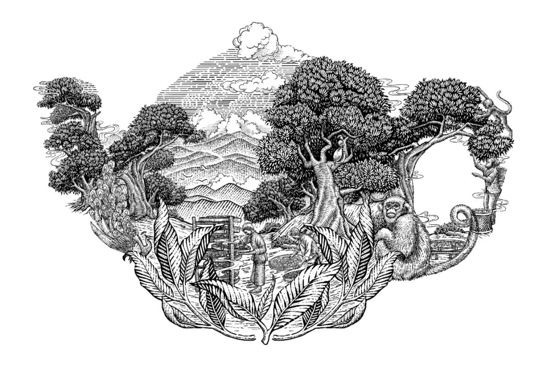
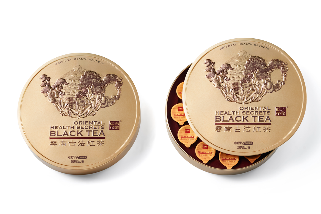
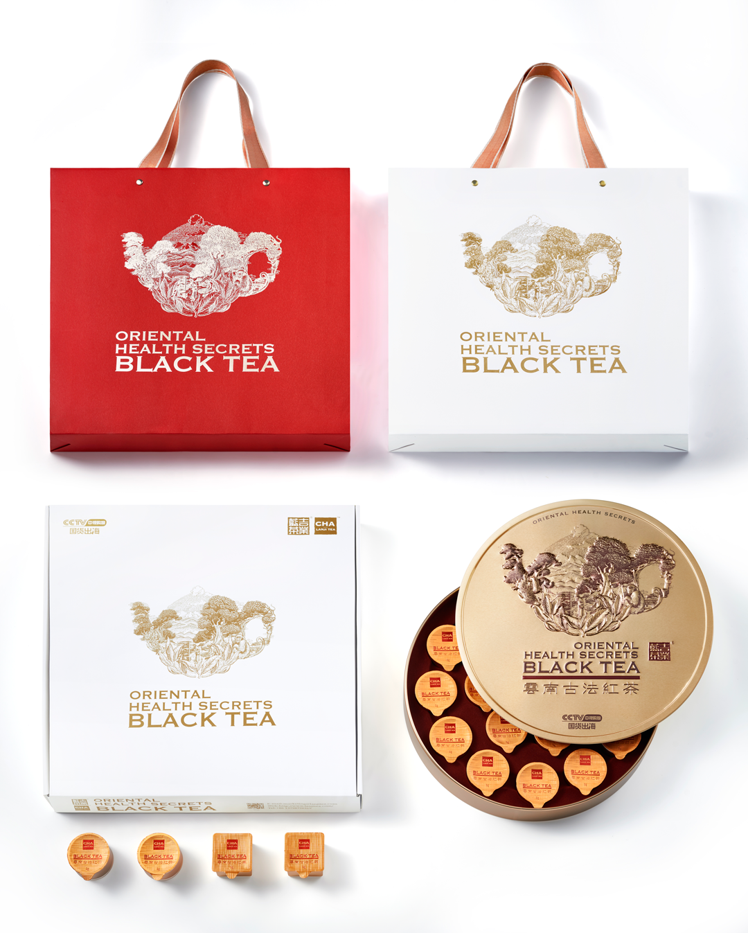
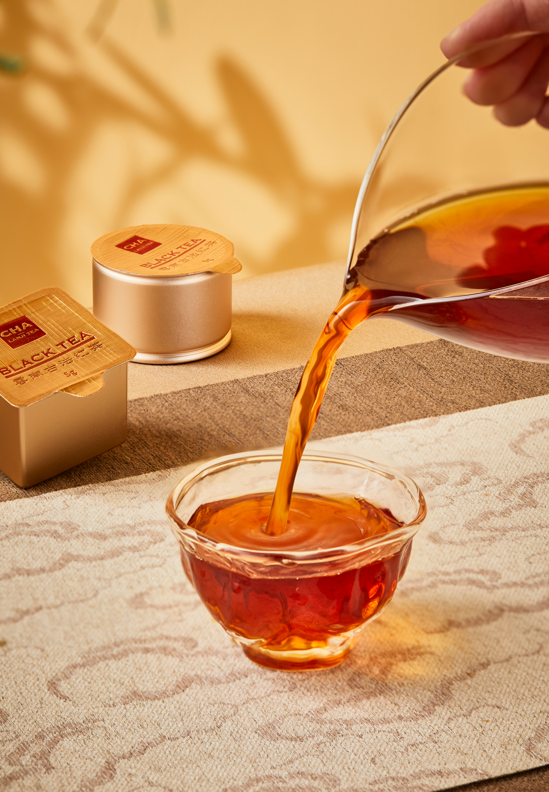
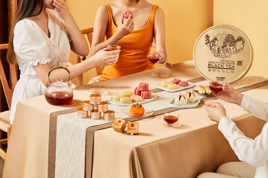
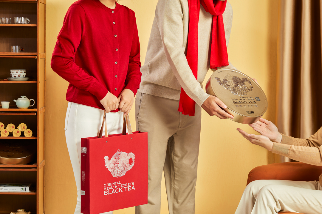
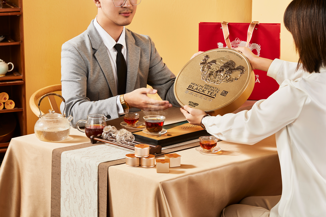
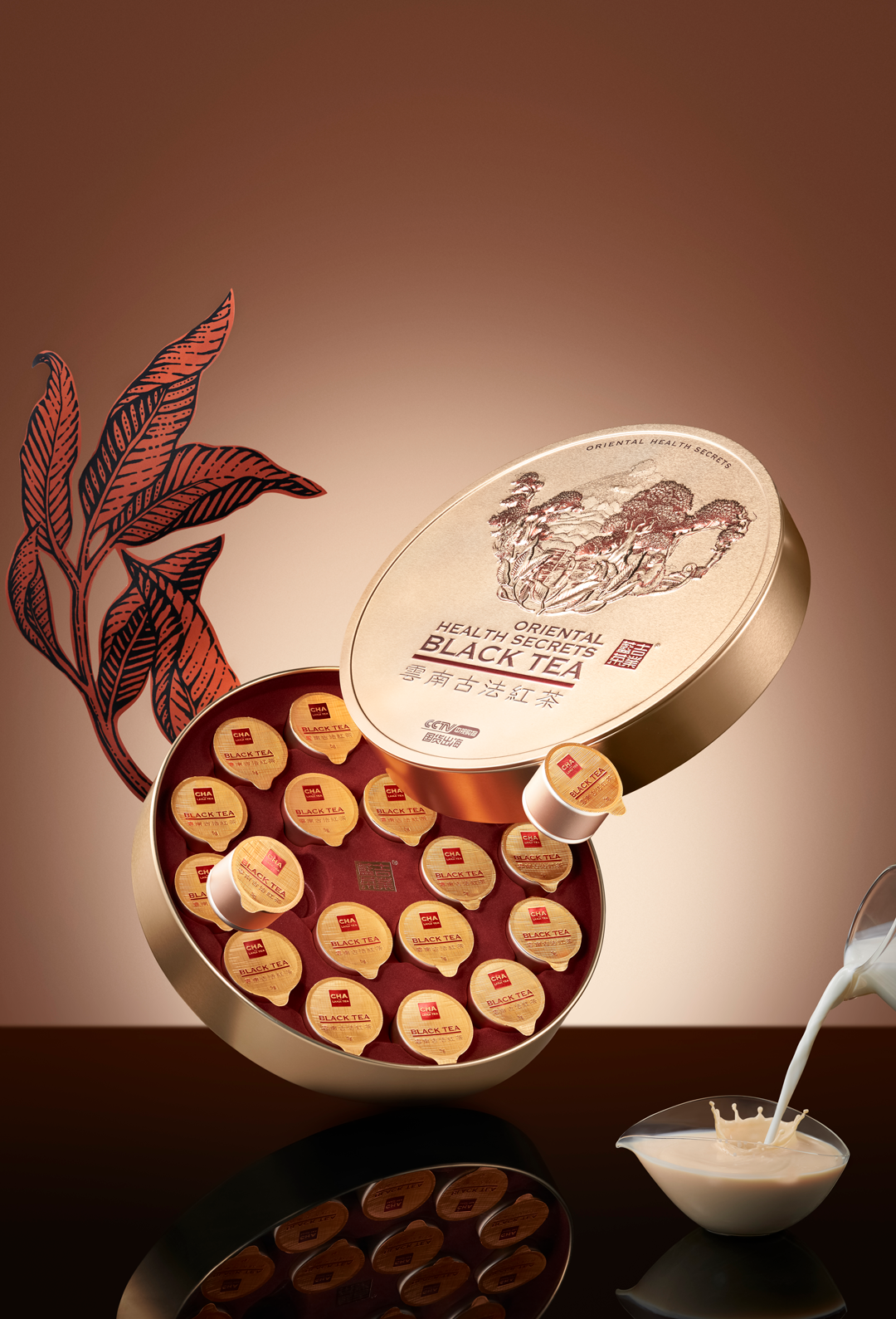
包装主形象用超级符号“茶壶”以插画的形式表现,圆形更具东方韵味、同时铁质的礼盒结合西方人对茶的印象。插画展现了一幅云南高山古树、风景旖旎、同时融入了茶人采茶、制茶,孔雀、长臂猿等与自然共生的的画面,用3D浮雕工艺栩栩如生展示,营造浓厚的品茶氛围。
The main image of the packaging is expressed in the form of illustrations with the super symbol "teapot". The round shape has more oriental charm, and the iron gift box combines the Westerner's impression of tea. The illustration shows a picture of ancient trees in high mountains in Yunnan, beautiful scenery, and at the same time, a picture of tea people picking and making tea, peacocks, gibbons, etc. co-existing with nature. It is vividly displayed with 3D relief echnology, creating a strong atmosphere of tea tasting.
大作精品施工
YEAR: 2022
CLIENT: 大作 Dazuo
TYPE: BRAND IDENTITY & IP
CLIENT: 大作 Dazuo
TYPE: BRAND IDENTITY & IP
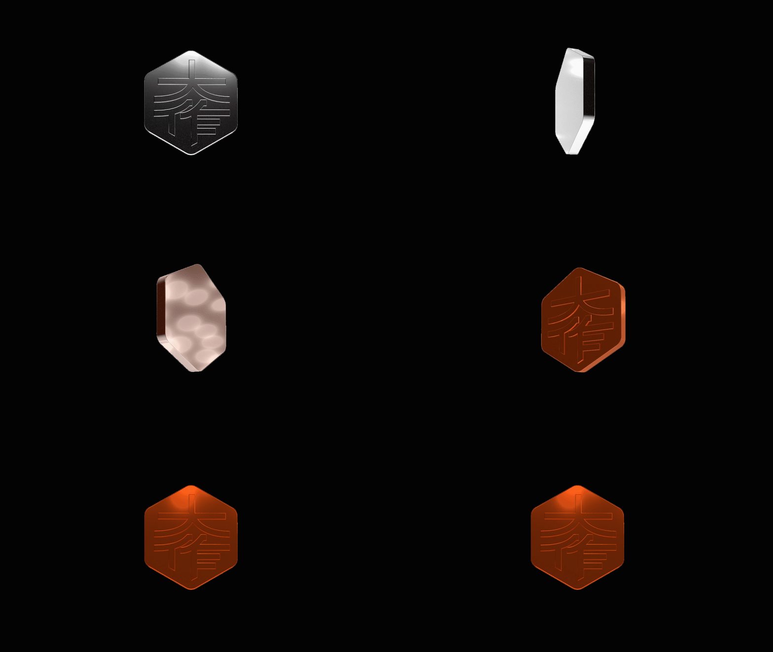
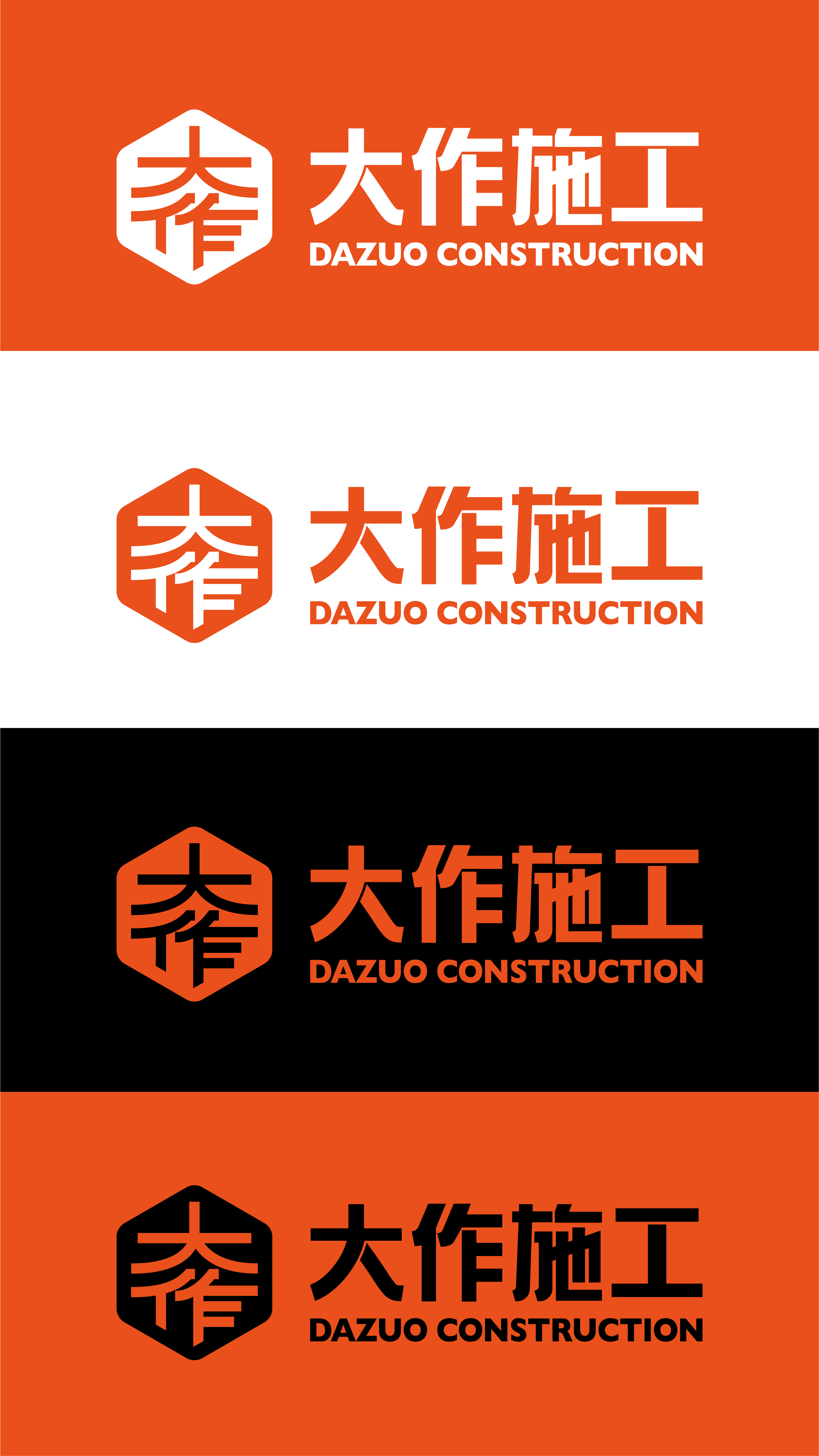
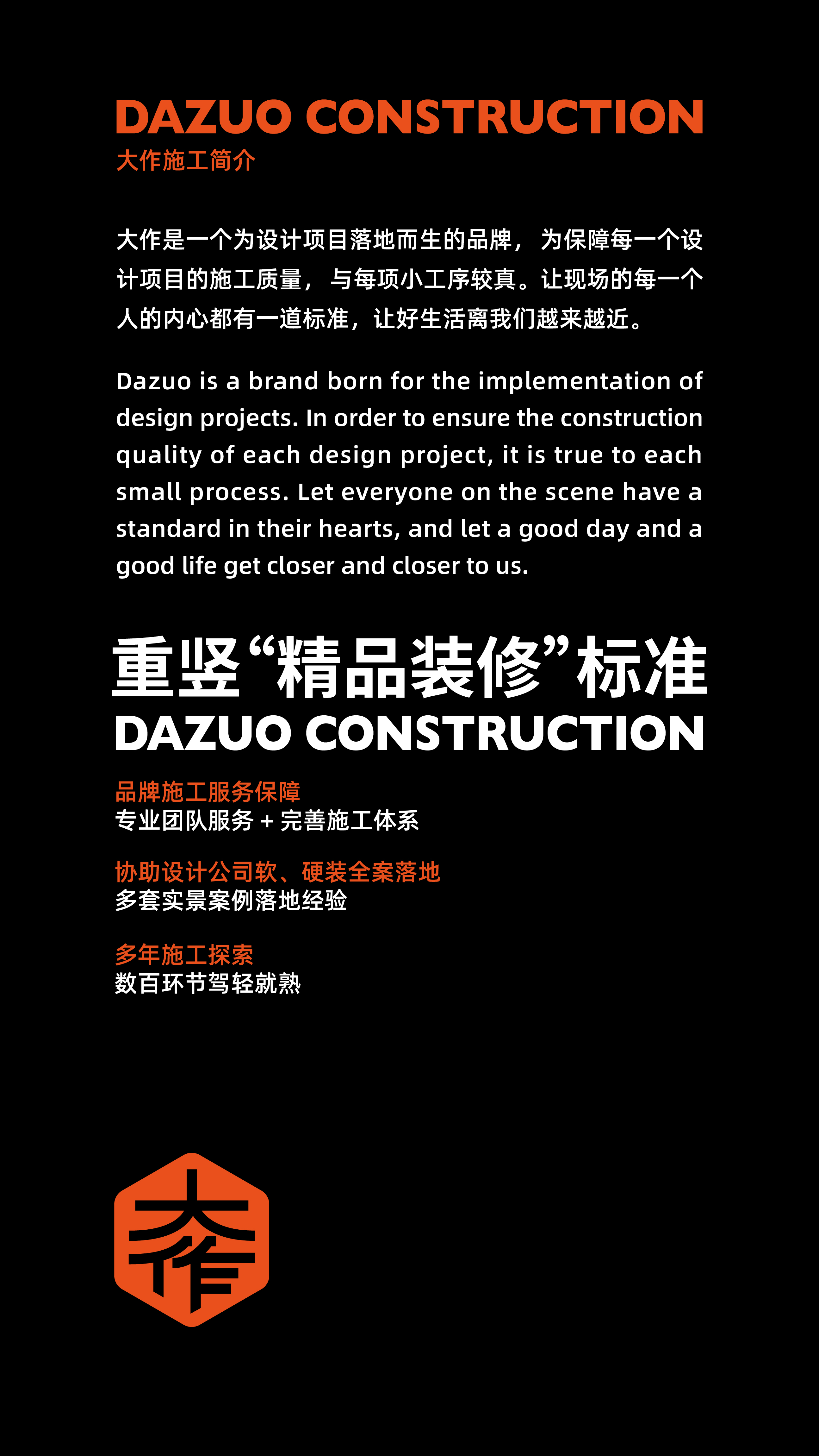
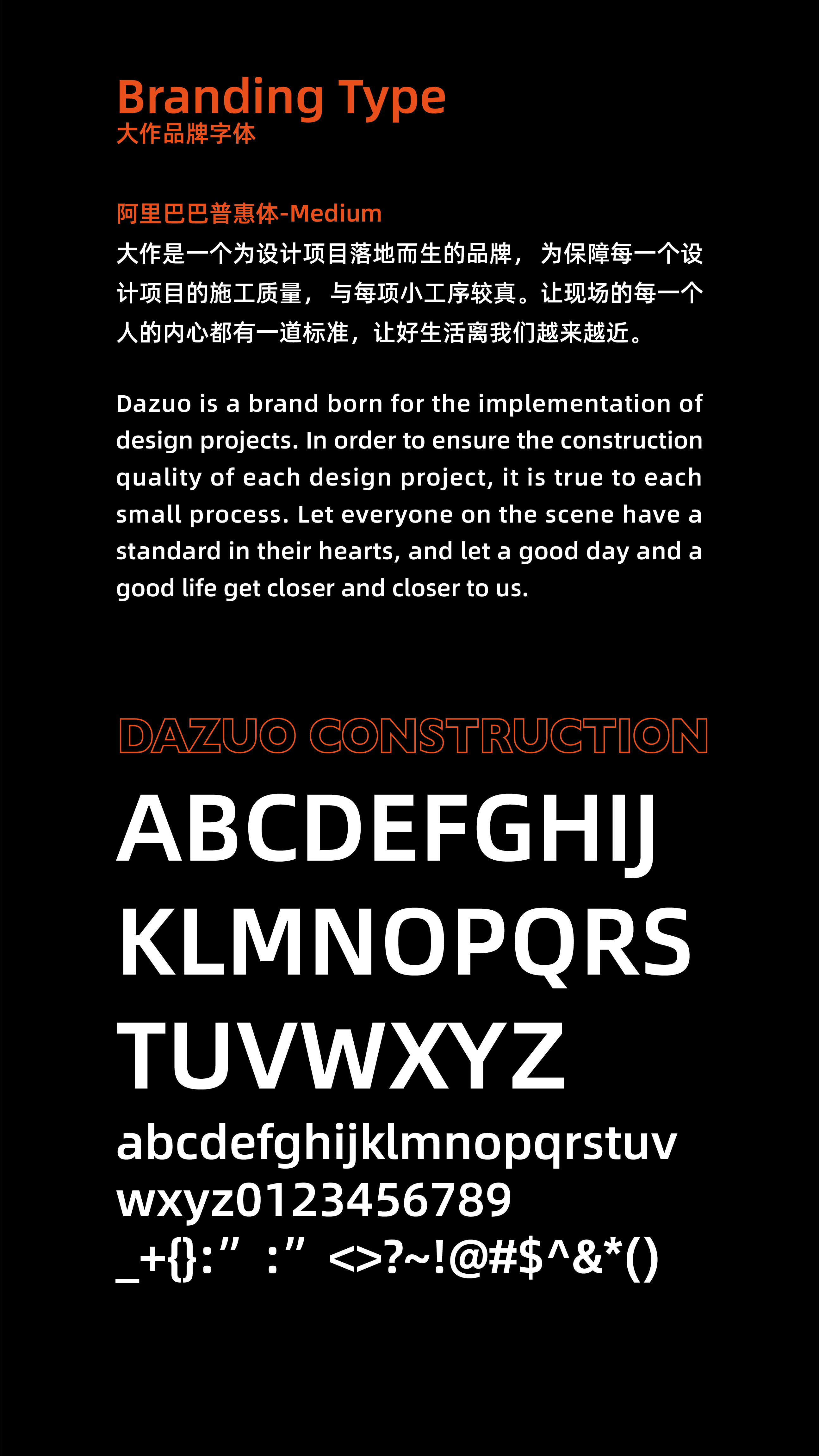
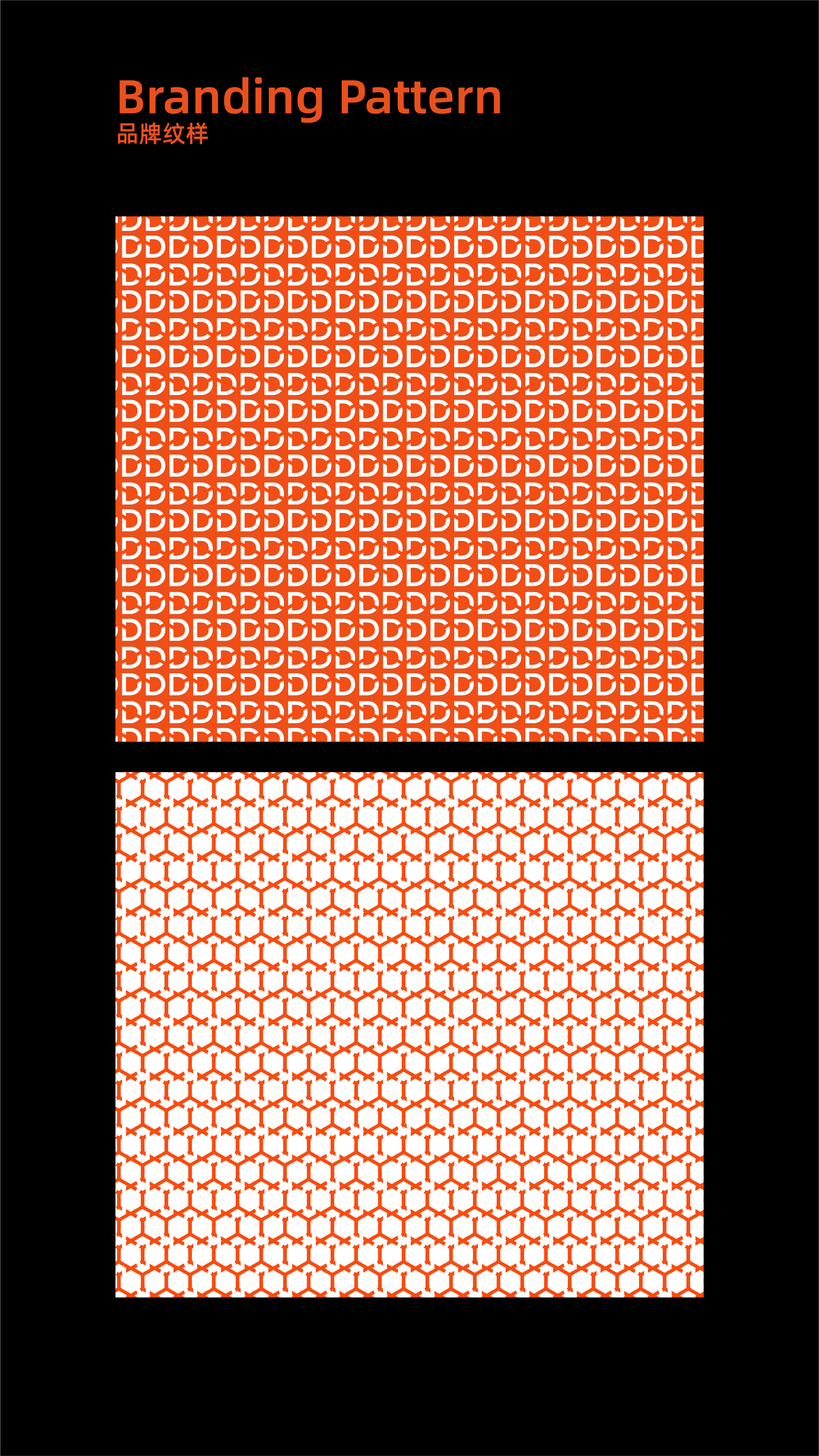
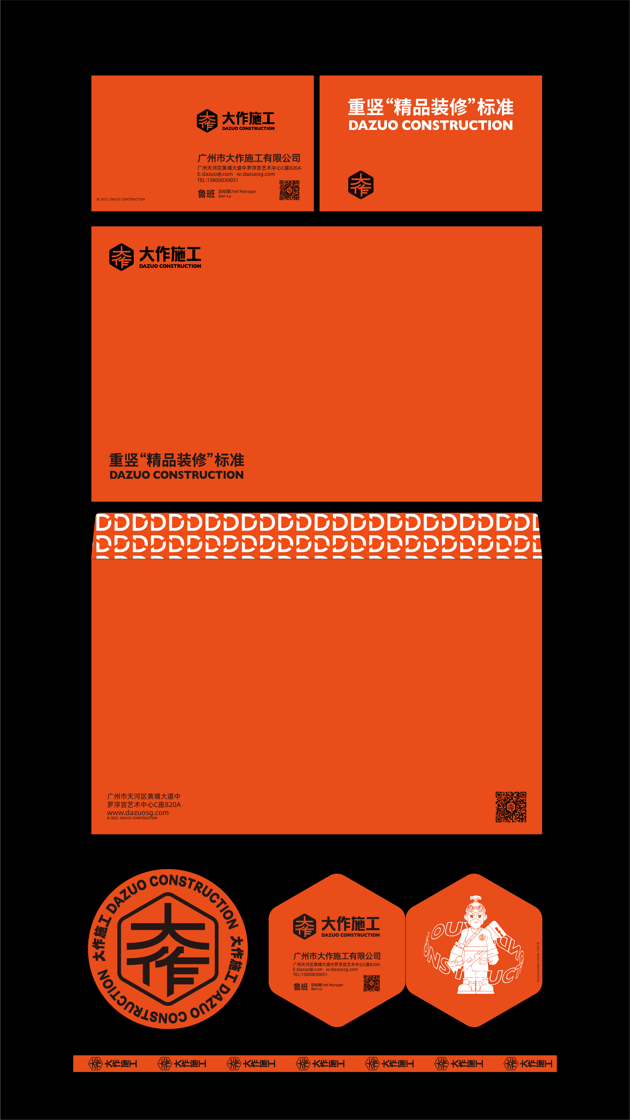
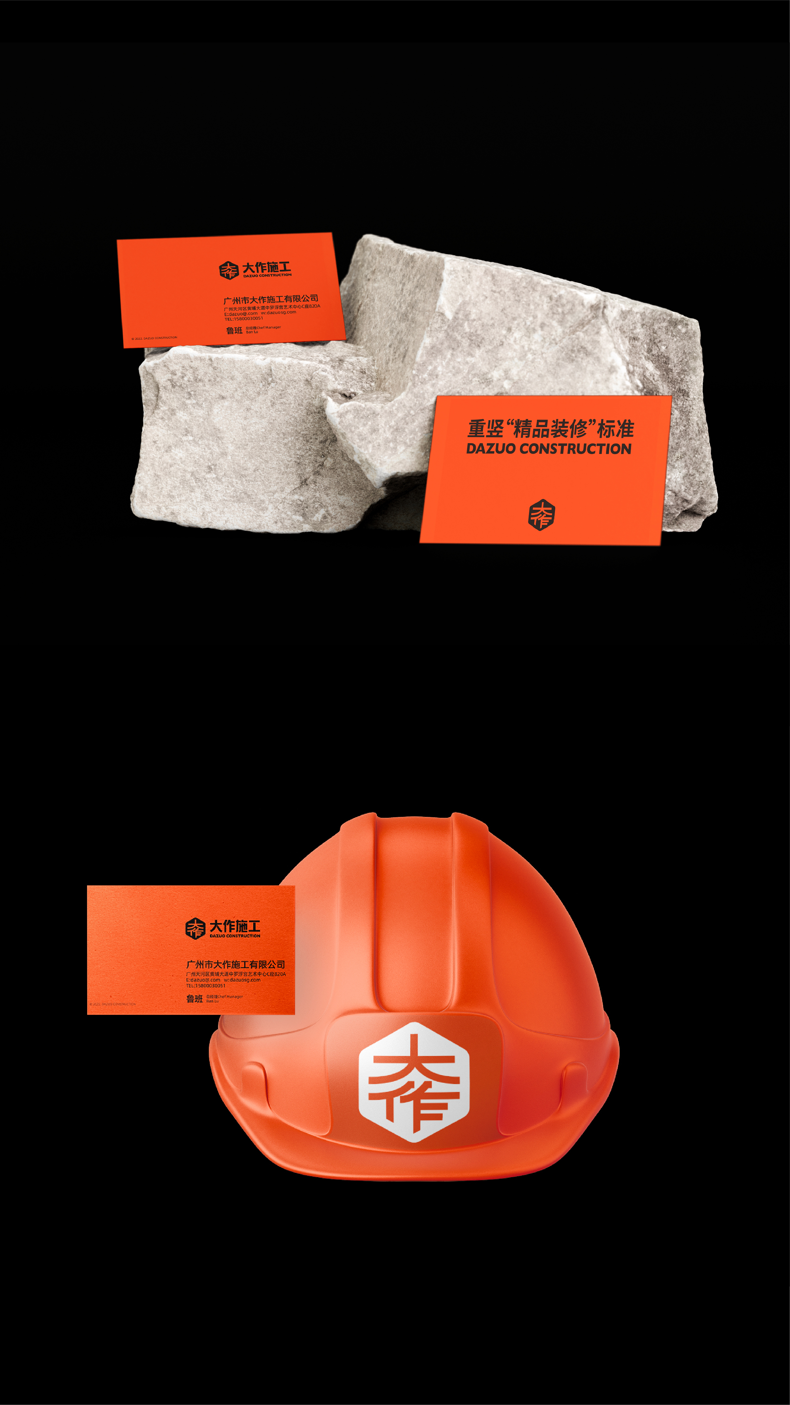
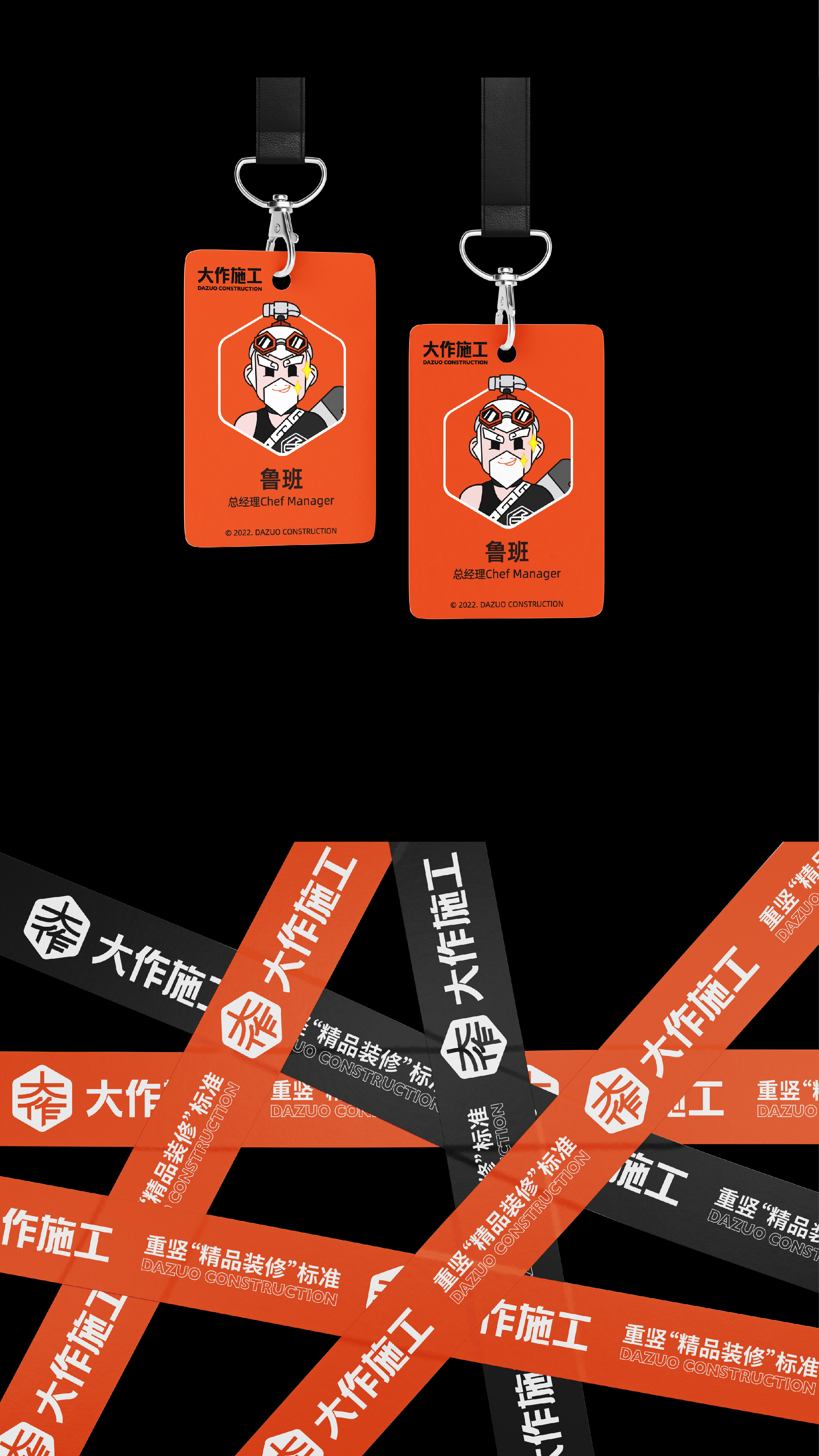
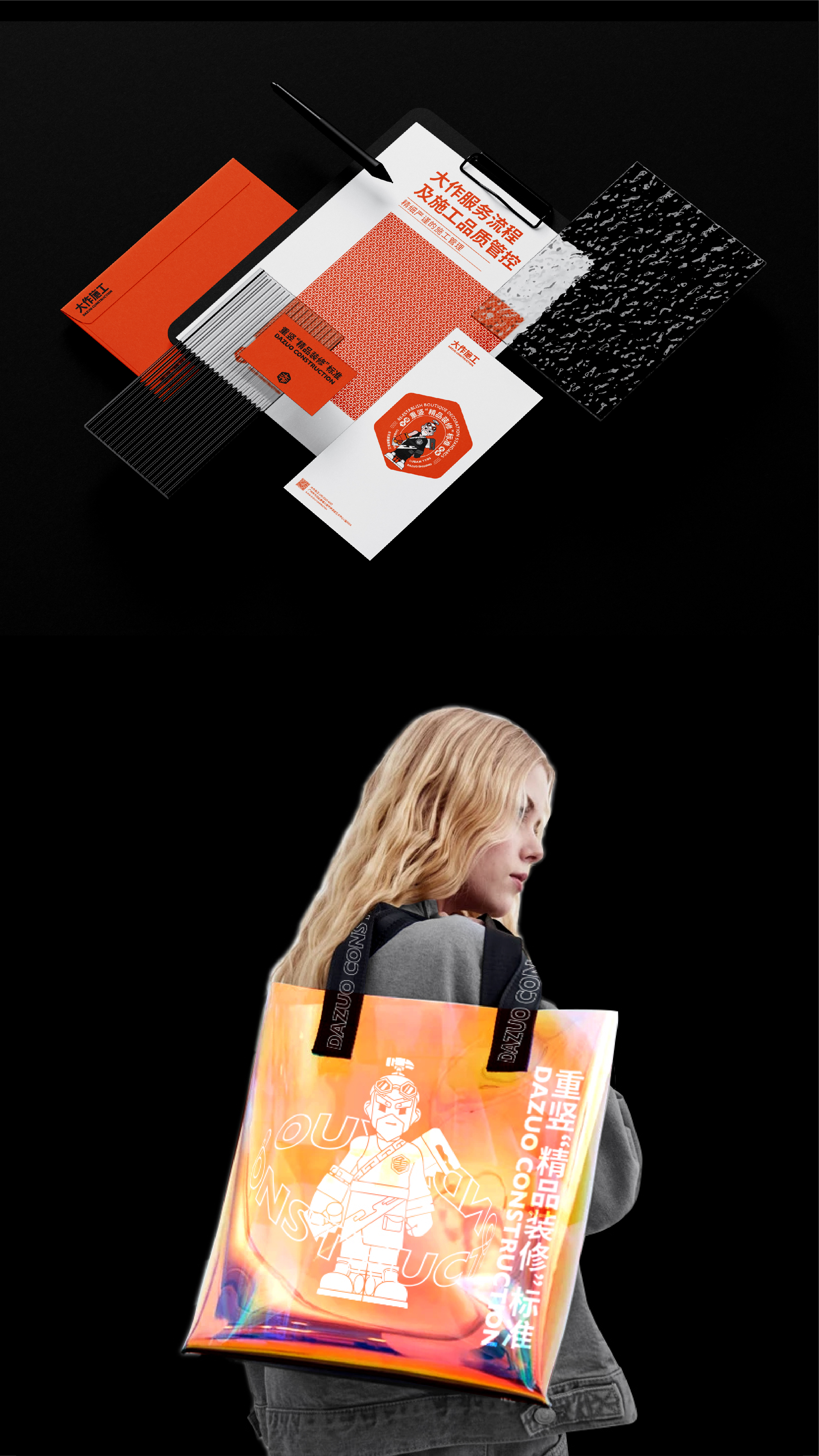
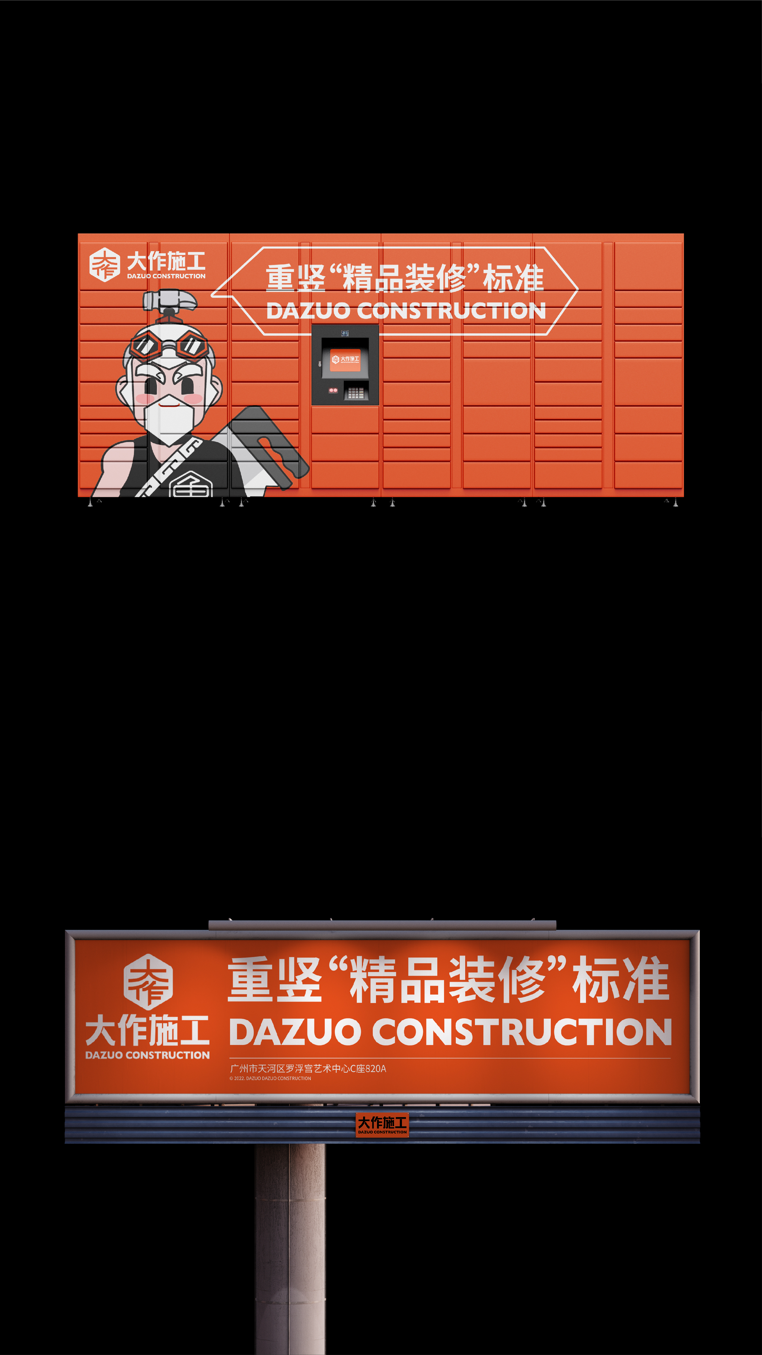
大作是一个专注在设计项目落地的精品施工品牌。标志设计上,采取了给人稳定感、信赖感强烈的等边六边形,与“大作”二字结合,形成一个专属品牌图形标志。IP设计上则选定中国传统历史上最具人气的工匠形象——鲁班,用设计手法将其现代化;目标是在传统的施工行业里,以全新的的品牌形象突围,亲近更多的年轻需求客户群体,给客户留下更深刻品牌印象。
Dazuo is a boutique construction brand born for the implementation of design projects. In the logo design, an equilateral hexagon with a strong sense of stability and trust is adopted, which is combined with the word "Dazuo" to form an exclusive brand graphic logo. In the IP design, Luban, the most popular craftsman image in traditional Chinese history, was selected to modernize it with design techniques; the goal is to break through with a brand-new brand image in the traditional construction industry and get closer to more young people’s needs customer groups, leaving a deeper brand impression on customers.
羊没了
YEAR: 2021
CLIENT: Yangmeile 羊没了
CLIENT: Yangmeile 羊没了
TYPE: Naming & Brand Identity
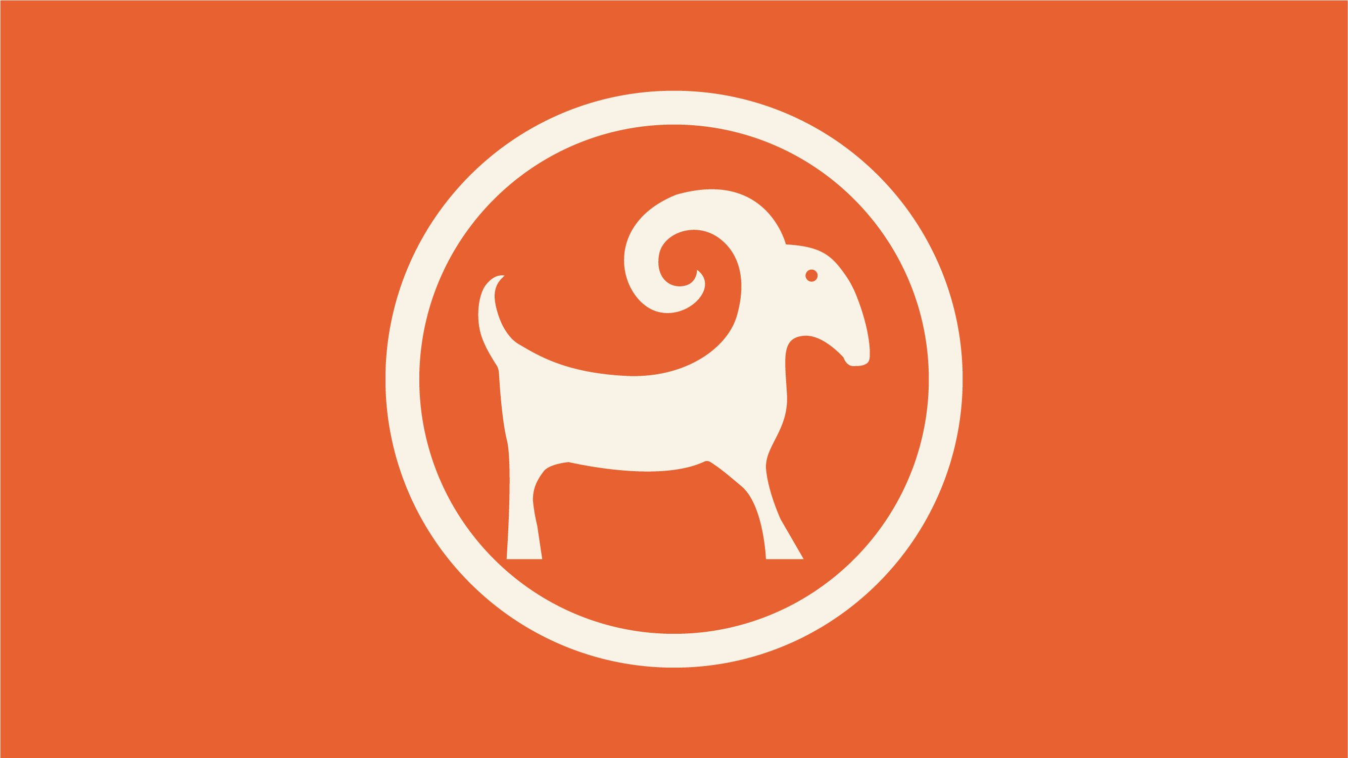
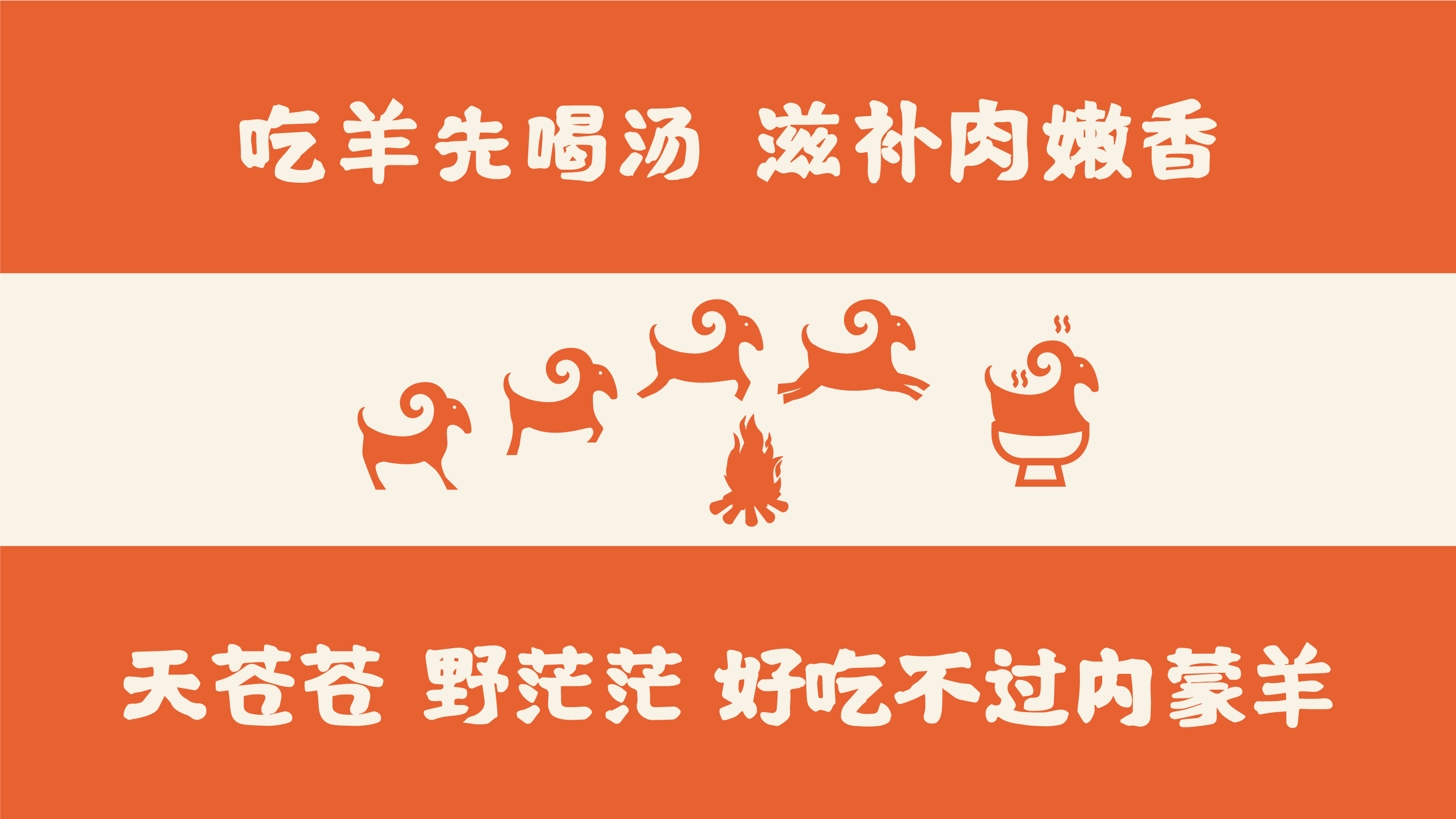
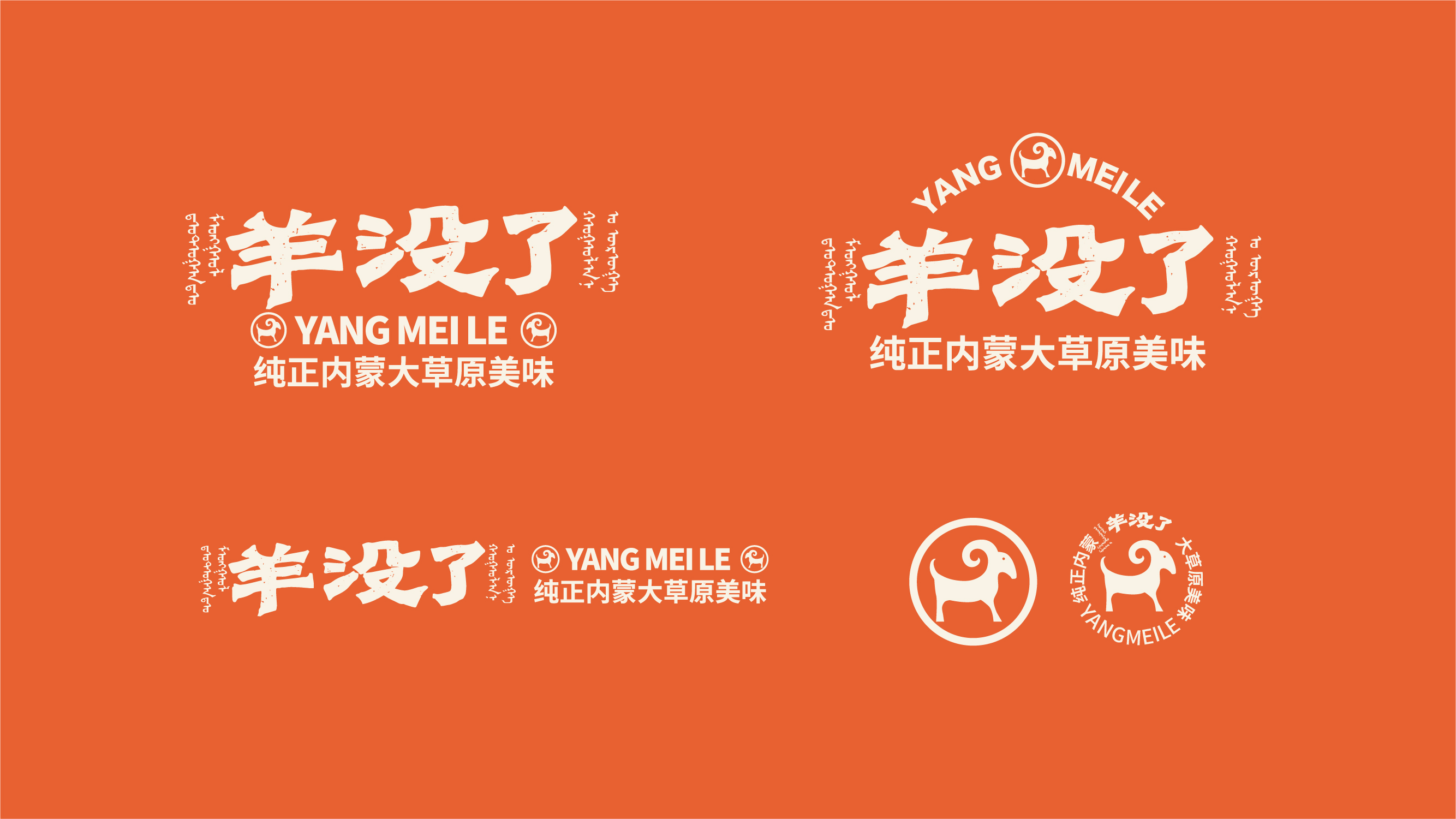
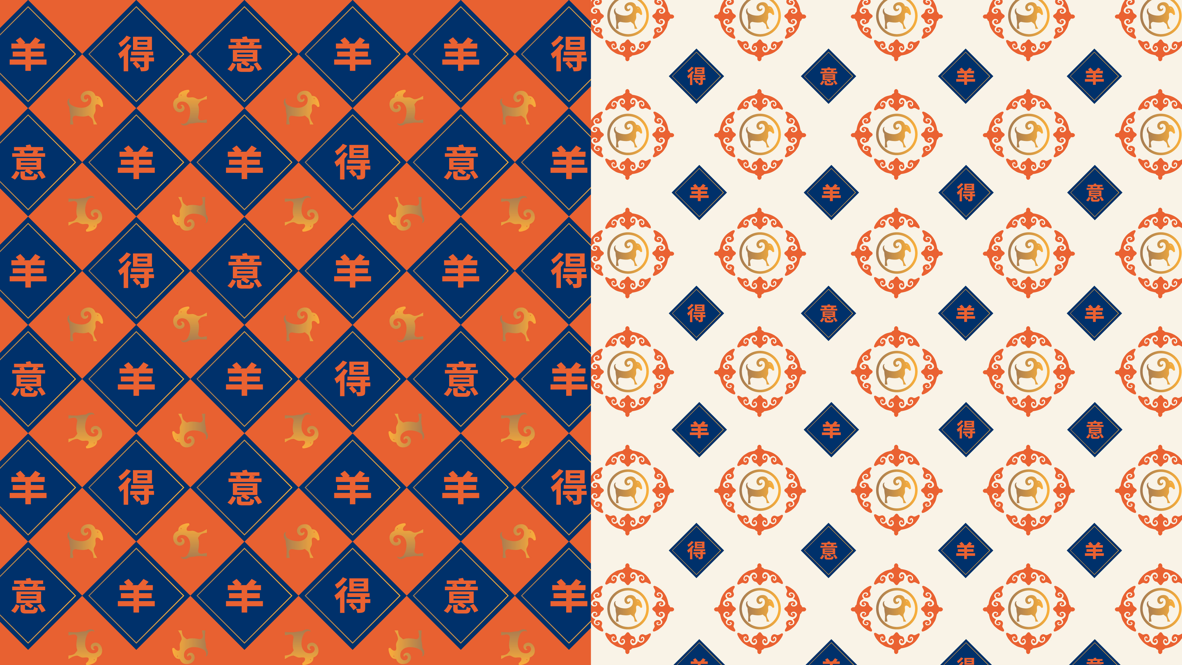
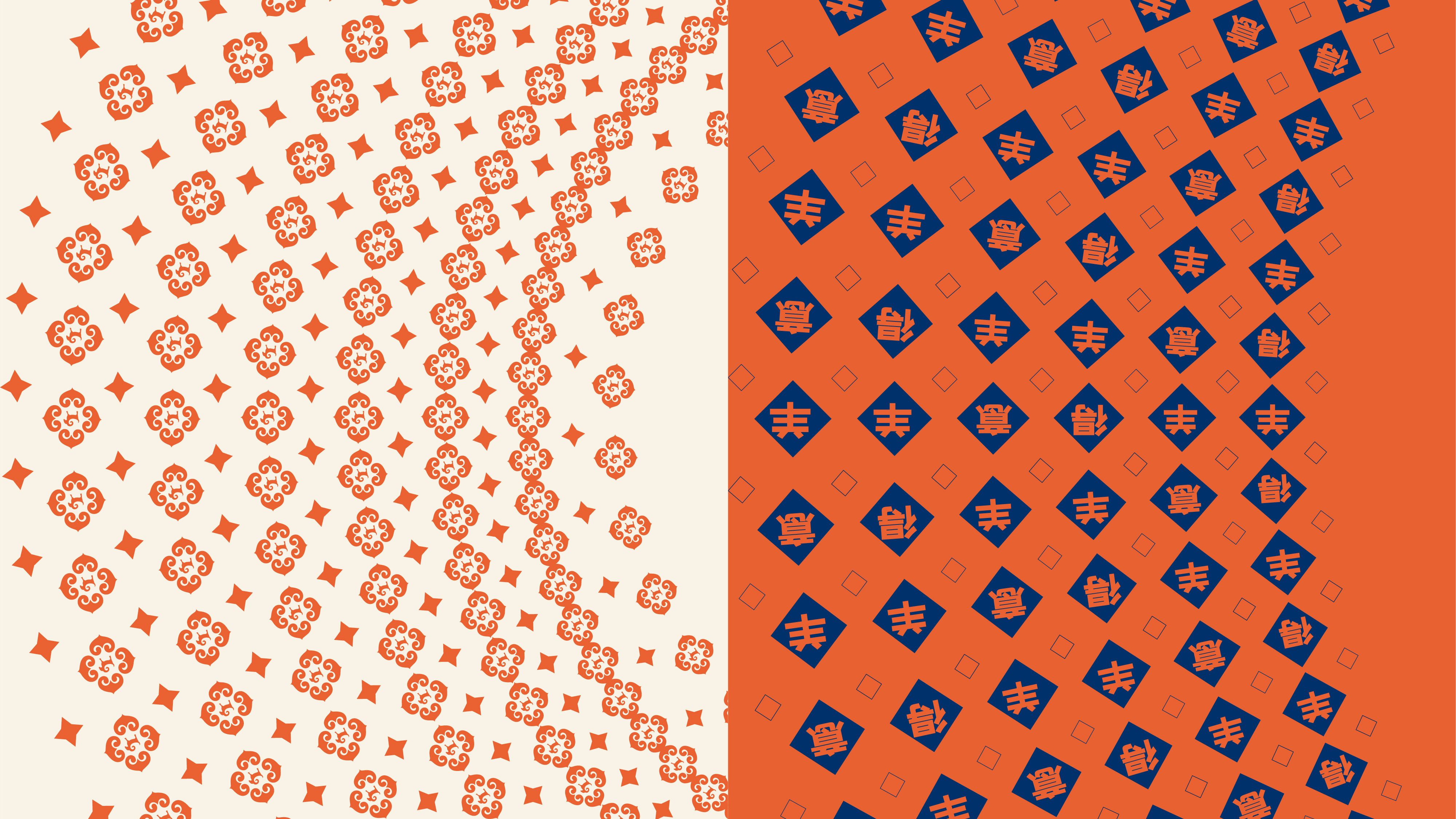
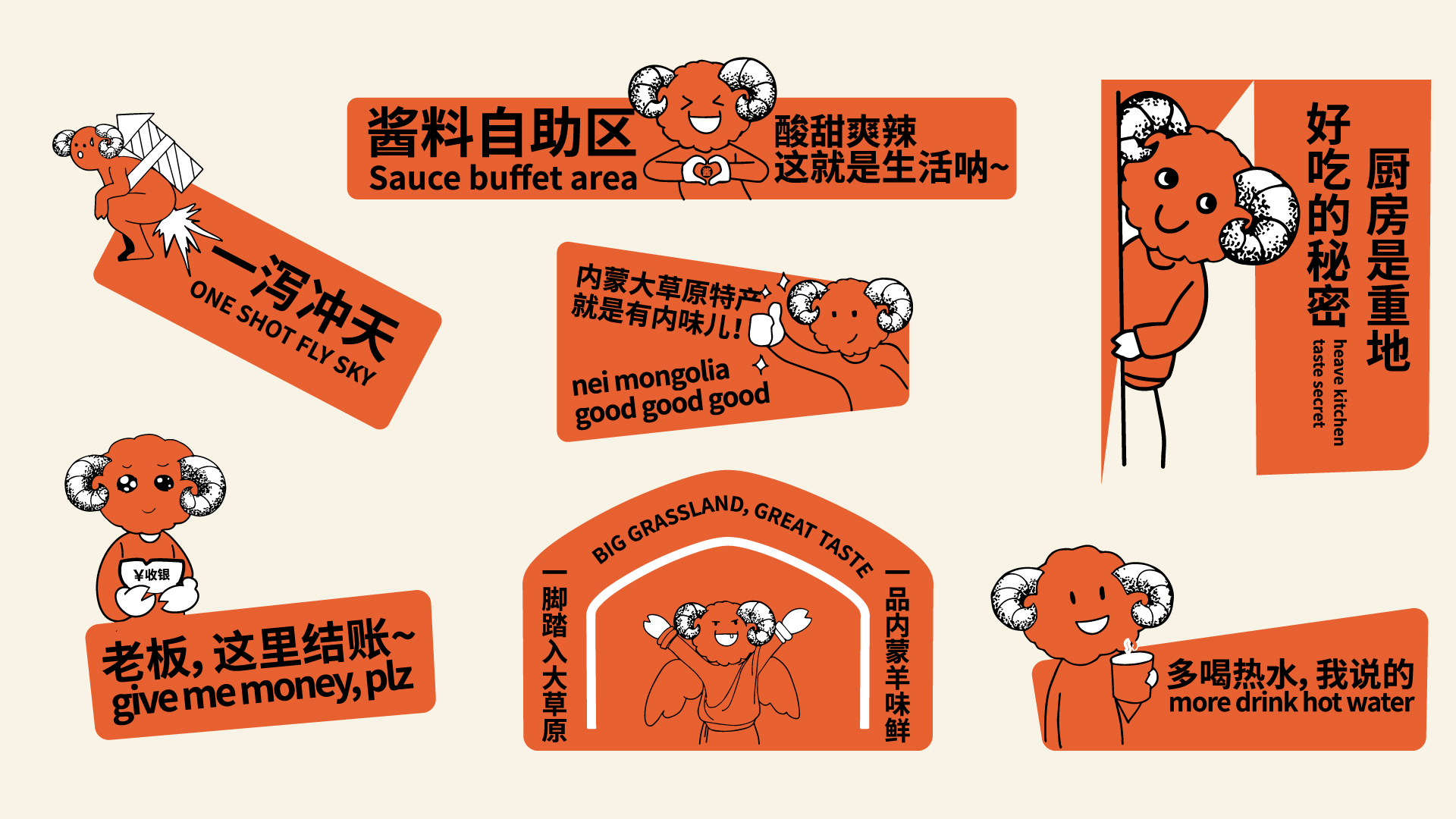
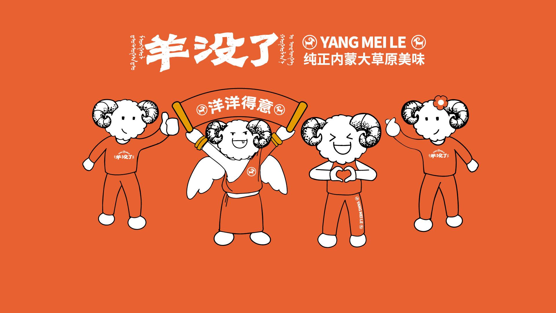
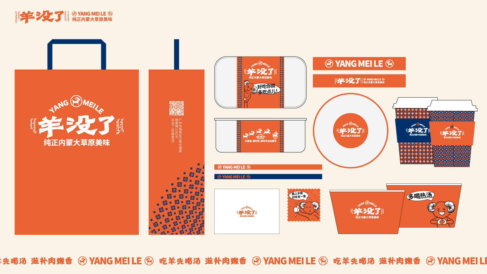
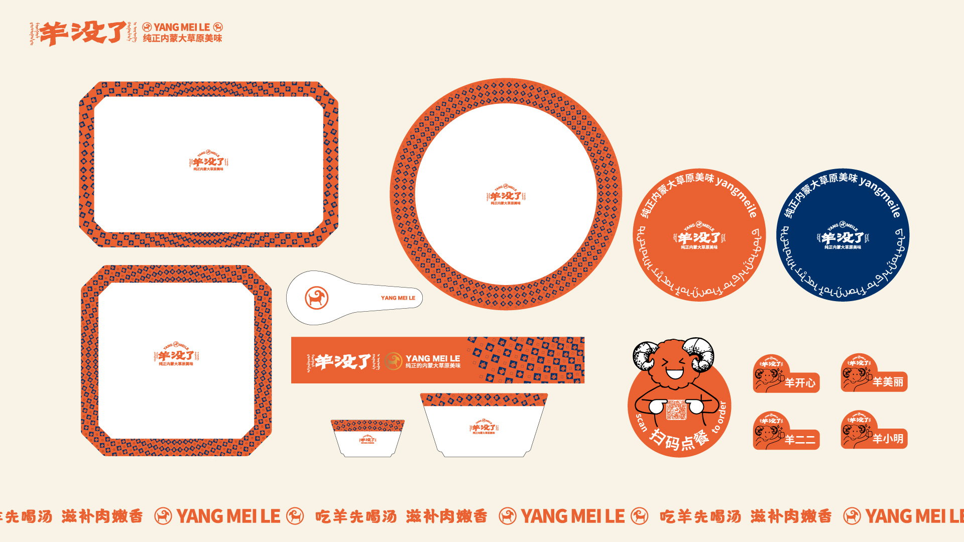
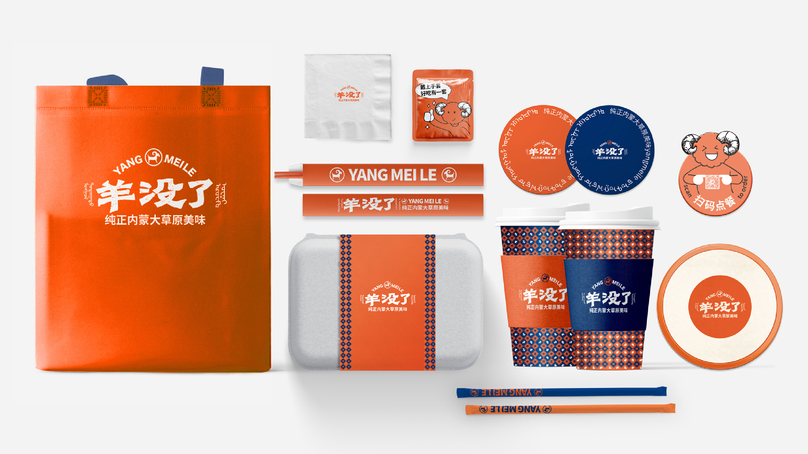
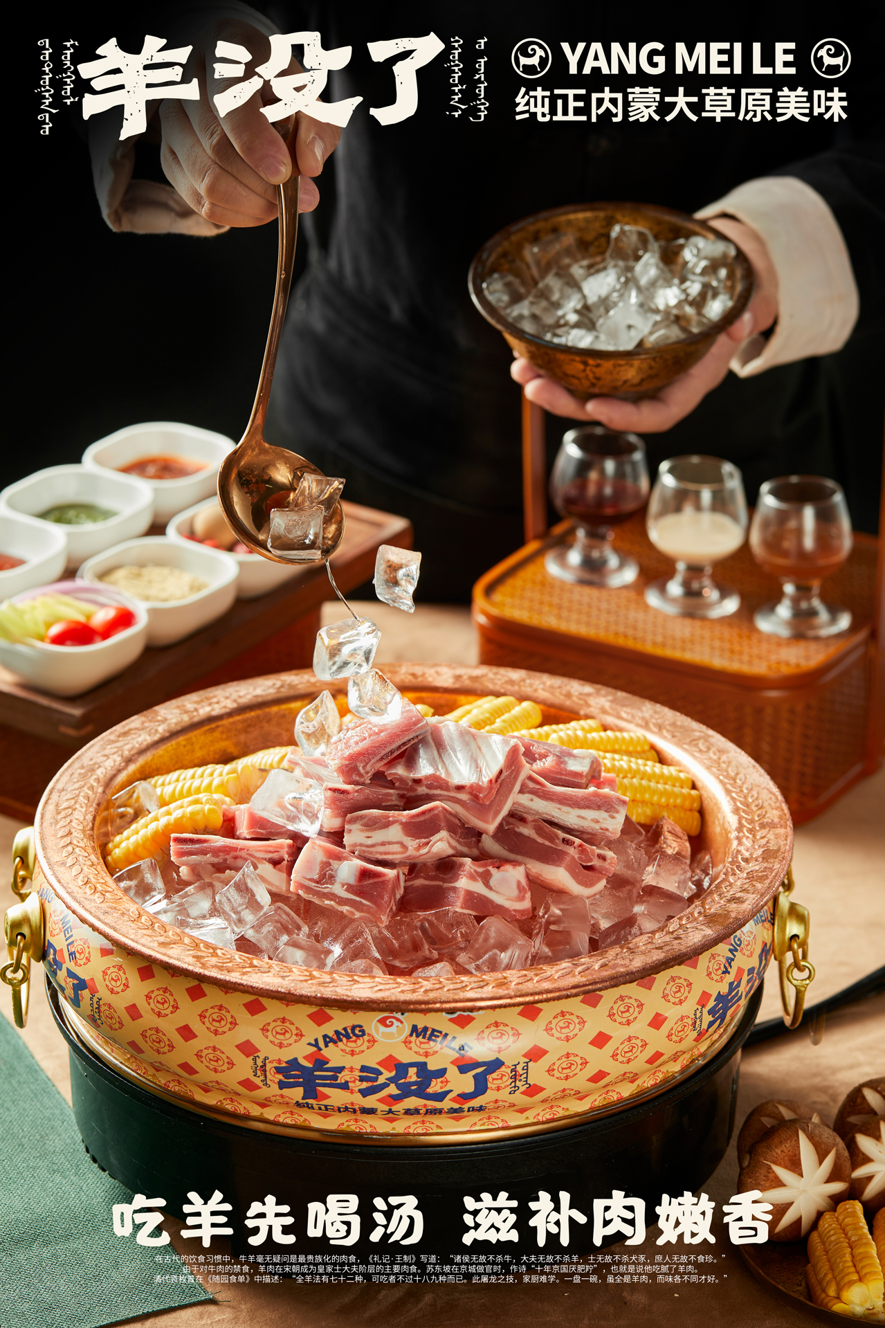
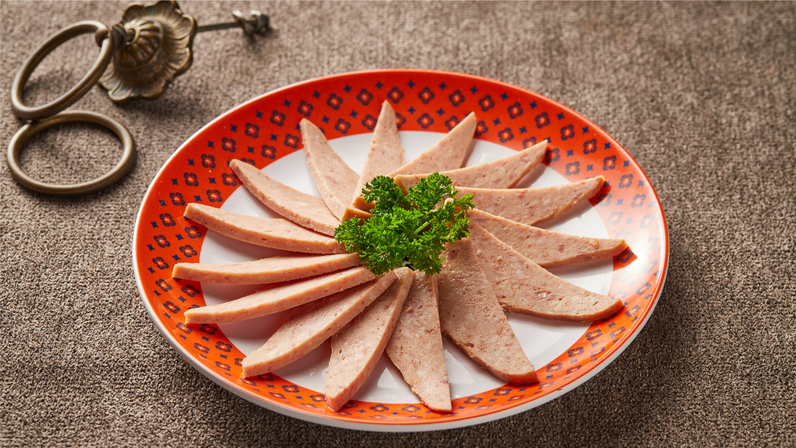
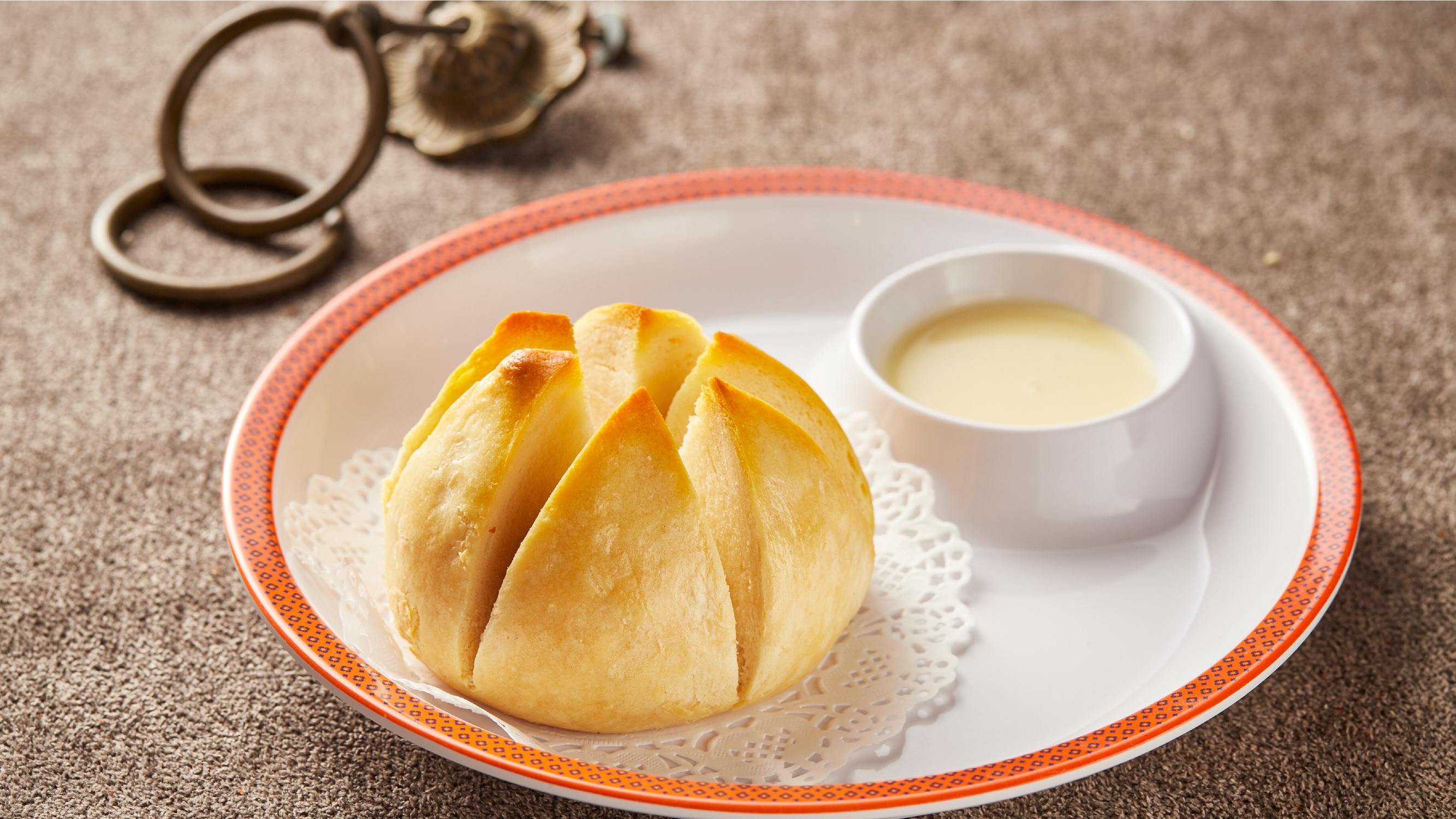
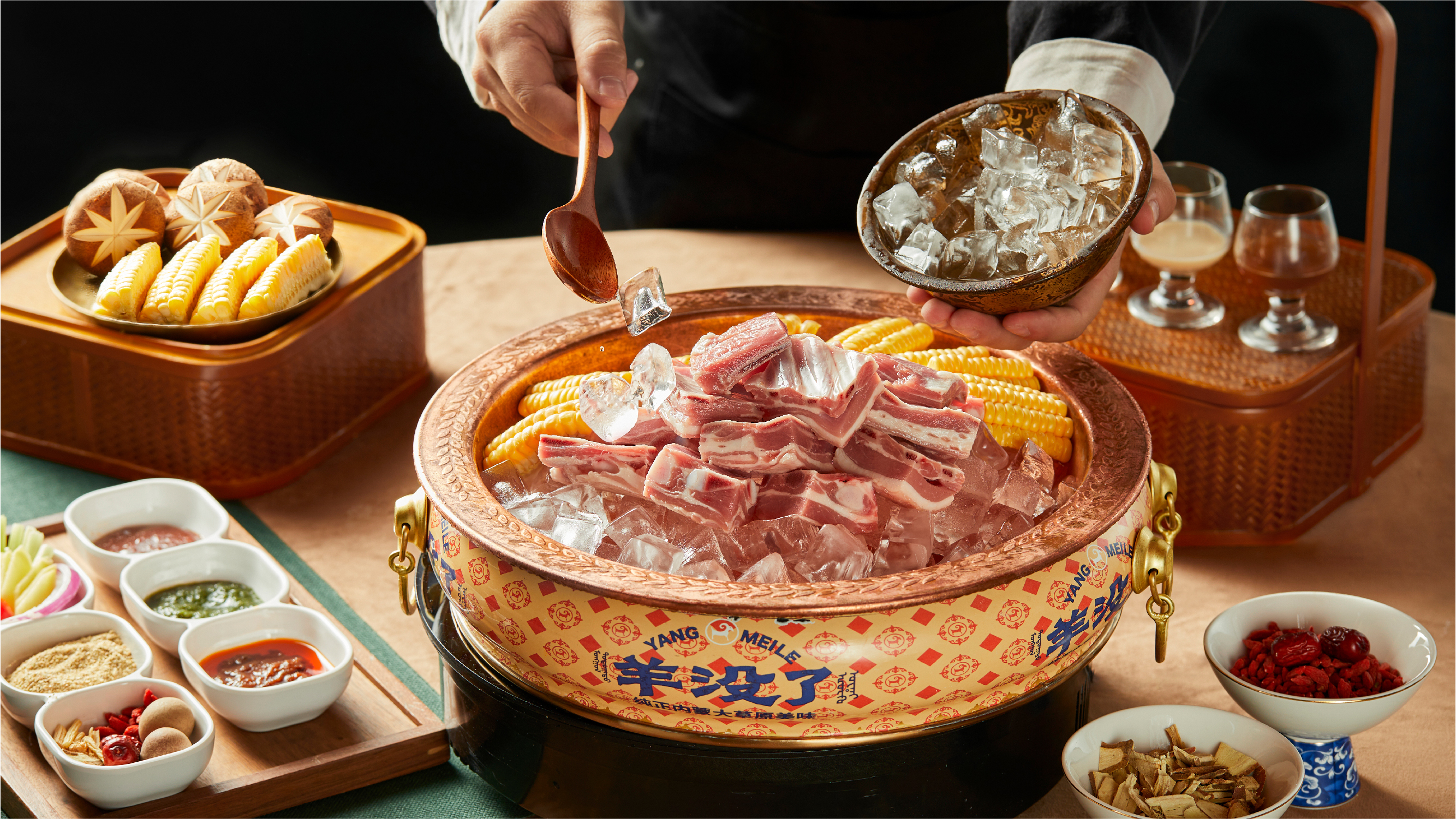
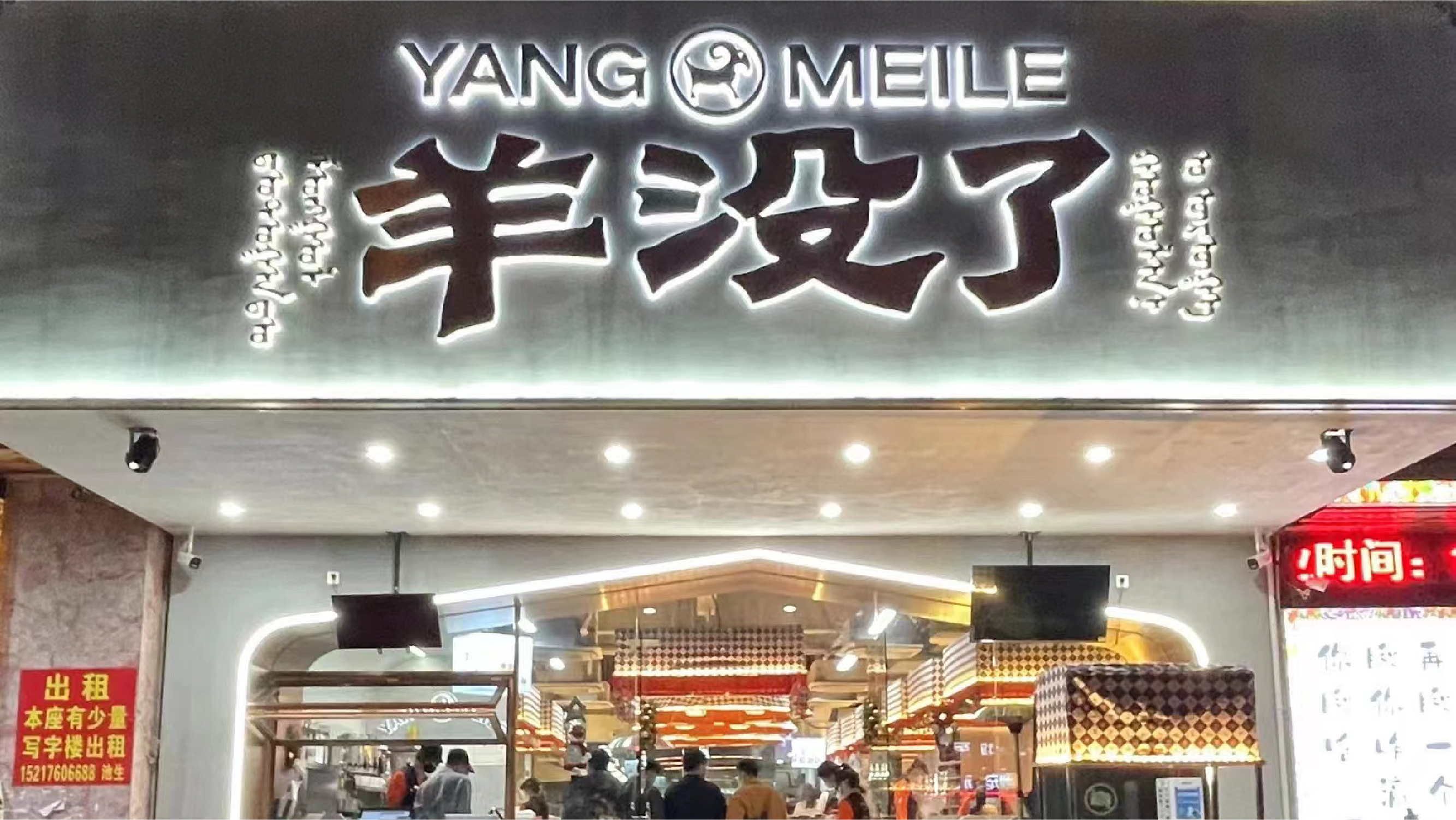
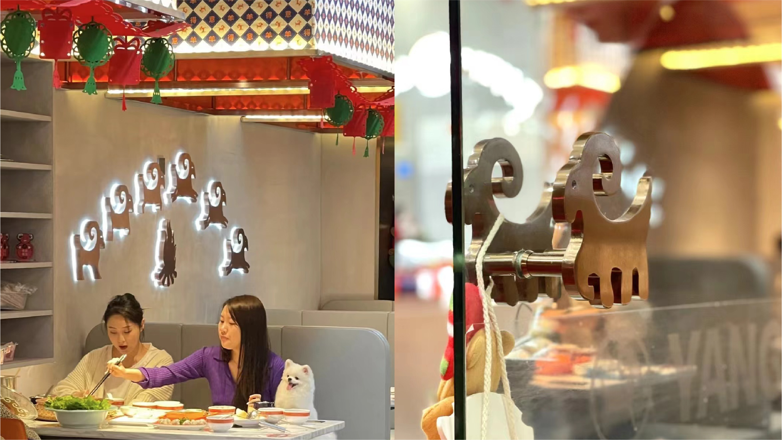
羊没了®️ 是一家内蒙地道菜餐厅,提供纯正的内蒙食材和烹饪手法;餐厅涵盖午餐/晚餐/宵夜/特产零售等丰富消费场景,旨在打造一家年轻、有趣又有料的特色餐饮品牌。品牌形象设计上,图形取用内蒙羊作为品牌图形,直观形象地表达了品牌行业属性;配合书写感、粗粝的字体设计,激活消费者对内蒙地域风情的印象。
Yangmeile is an Inner Mongolian restaurant with pure ingredients, all originating from Inner Mongolia; the restaurant covers a variety of consumption scenarios such as lunch/dinner/supper/specialty retail, aiming to create a young, interesting and interesting specialty catering brand.
On branding, Yangmeile uses Inner Mongolia sheep as the primary brand graphic, which intuitively and vividly expresses the brand's industry attributes and strengthens the consumer's impression.
On branding, Yangmeile uses Inner Mongolia sheep as the primary brand graphic, which intuitively and vividly expresses the brand's industry attributes and strengthens the consumer's impression.
Leon Equestrian
YEAR: 2022
CLIENT: 立昂马术礼盒
TYPE: Package design
CLIENT: 立昂马术礼盒
TYPE: Package design
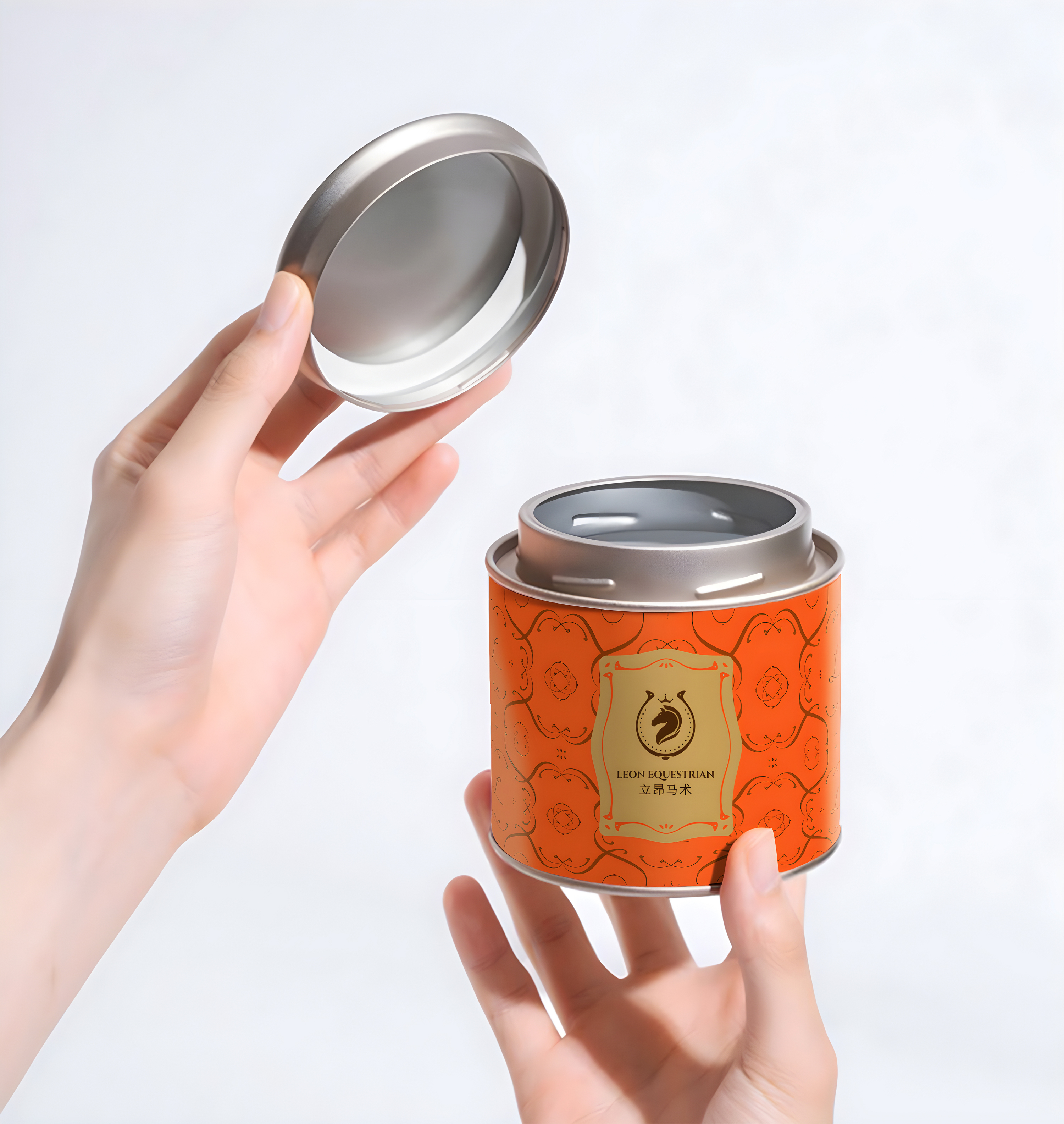
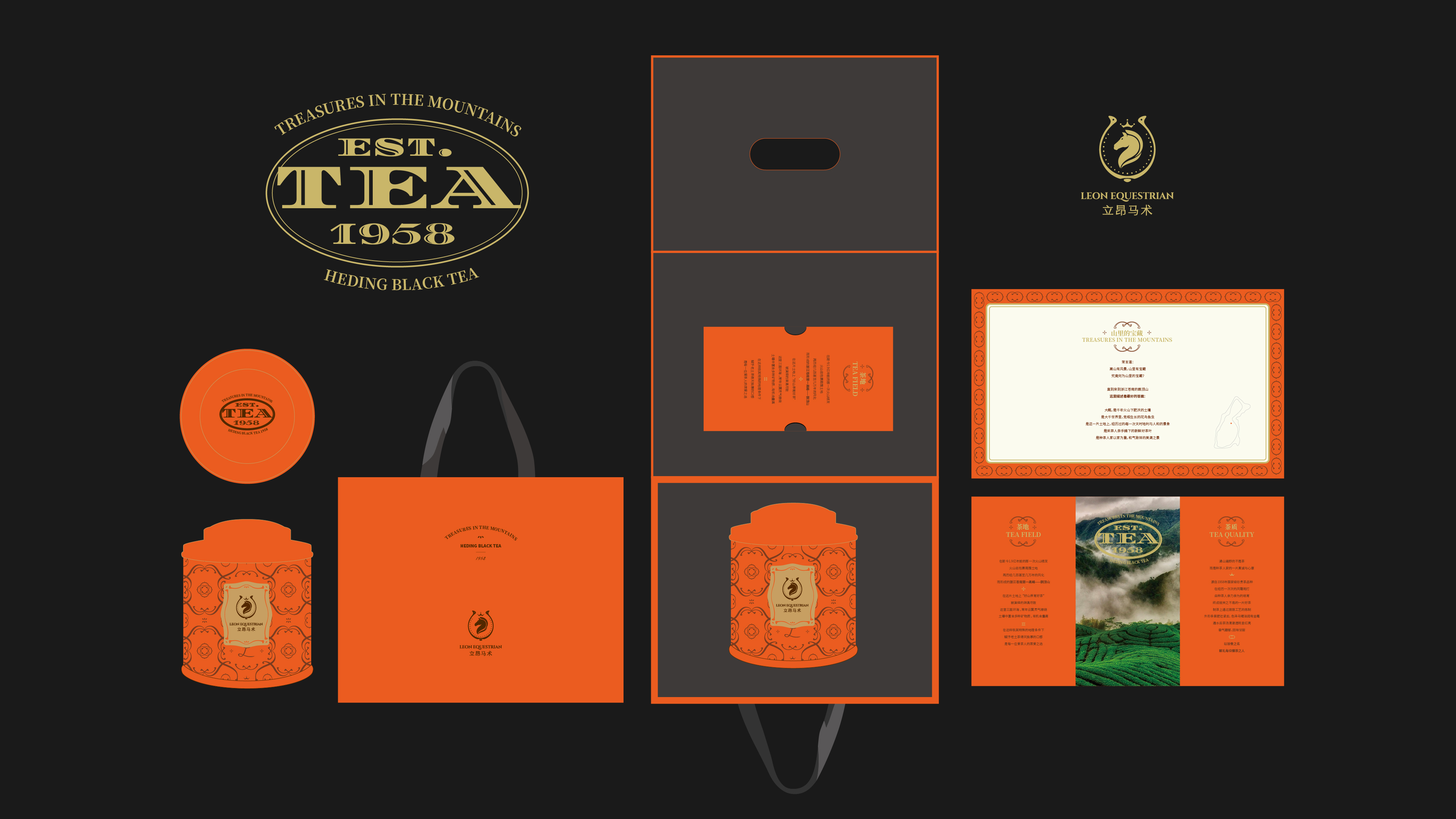
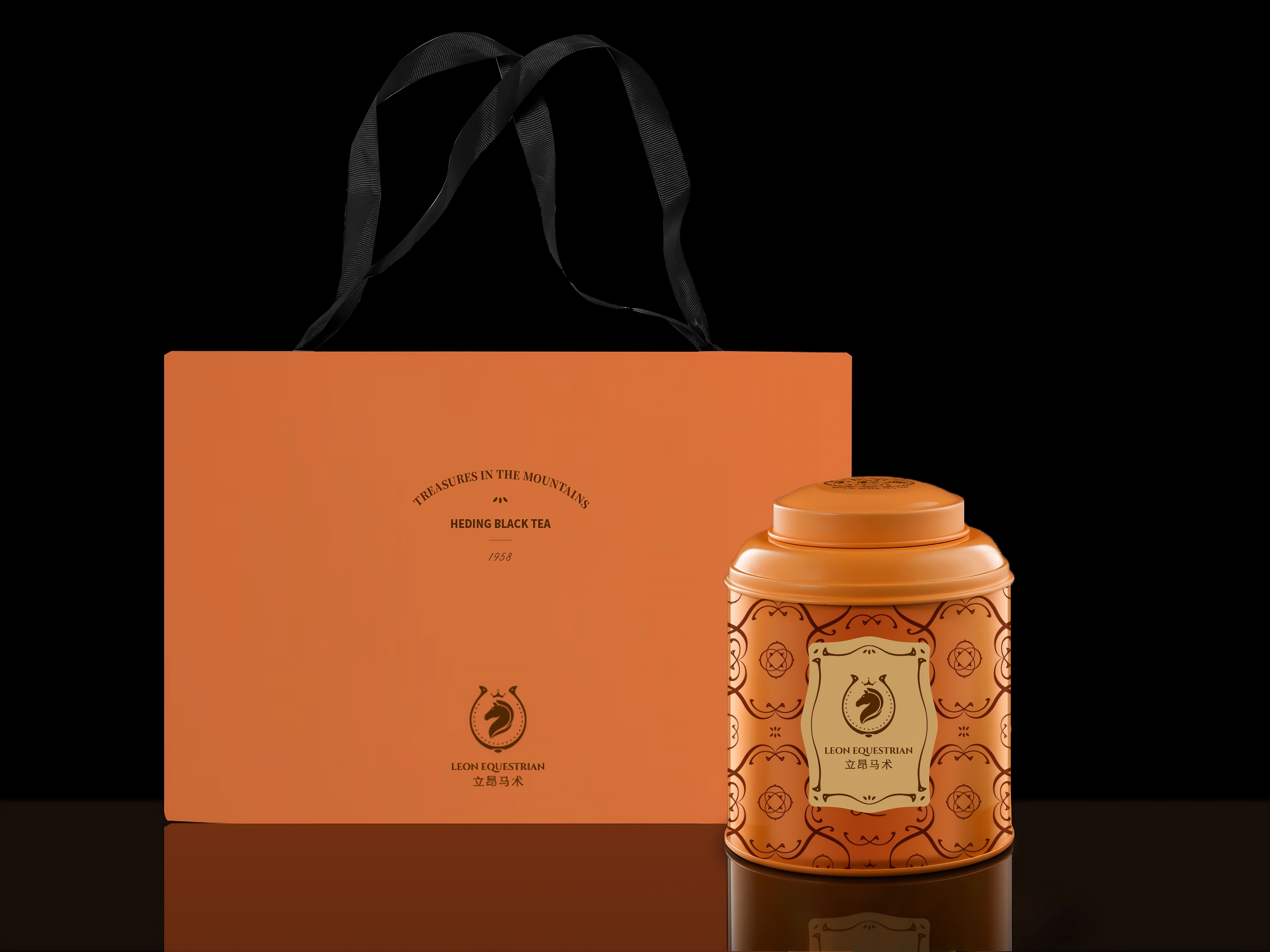
立昂马术是中国马术协会会员单位,英国马会BHS认证马场,澳洲小马俱乐部教学体系认证(PCA)专业英式马术教育培训机构。
Leon Equestrian is a member unit of the Chinese Equestrian Association, a horse farm certified by the British Jockey Club BHS, and a professional British equestrian education and training institution certified by the Pony Club of Australia (PCA).


